2019
UI/UX Designer / Front End Dev
2019
Figma, Photoshop, Visual Code, Wordpress
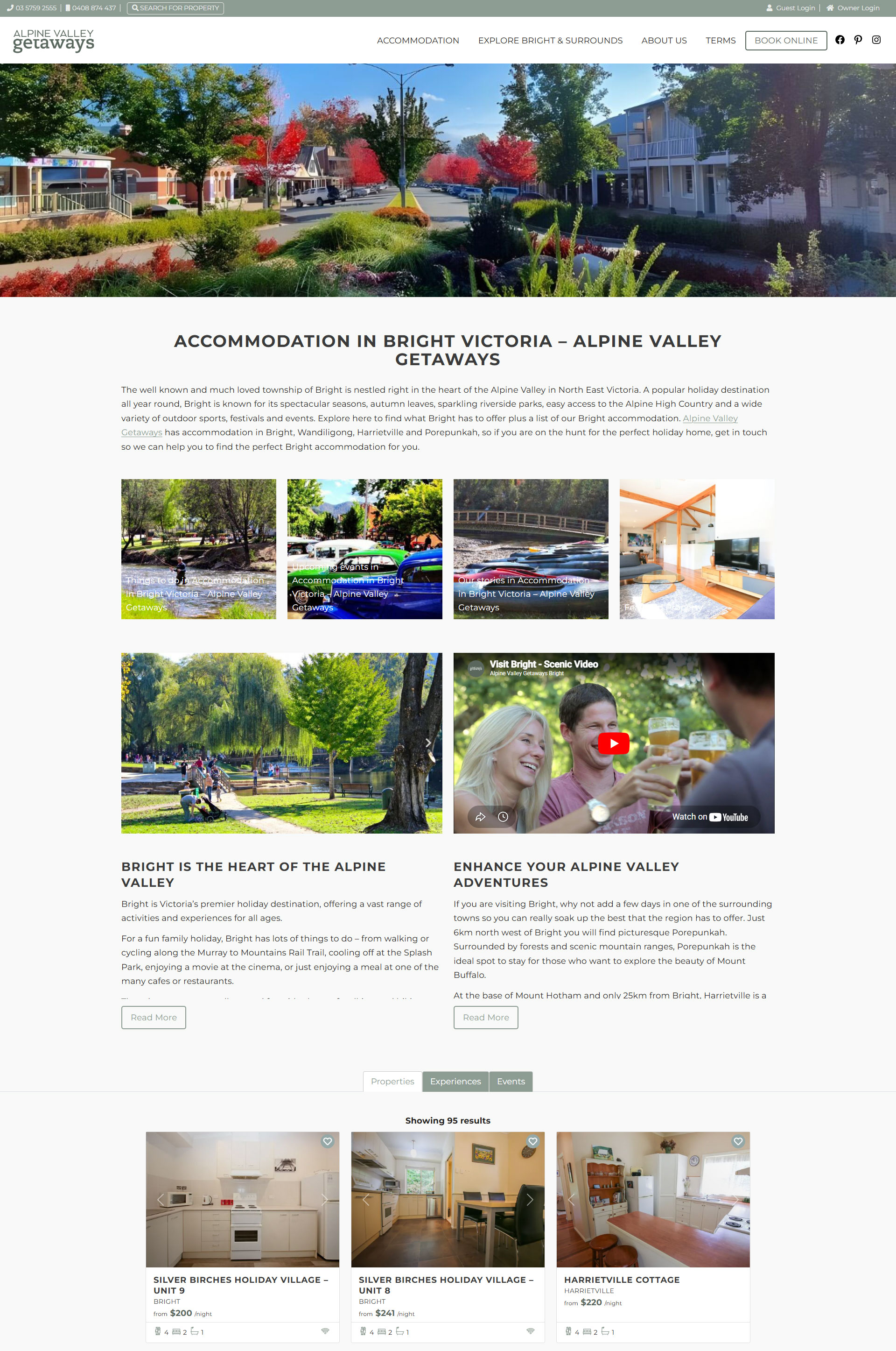
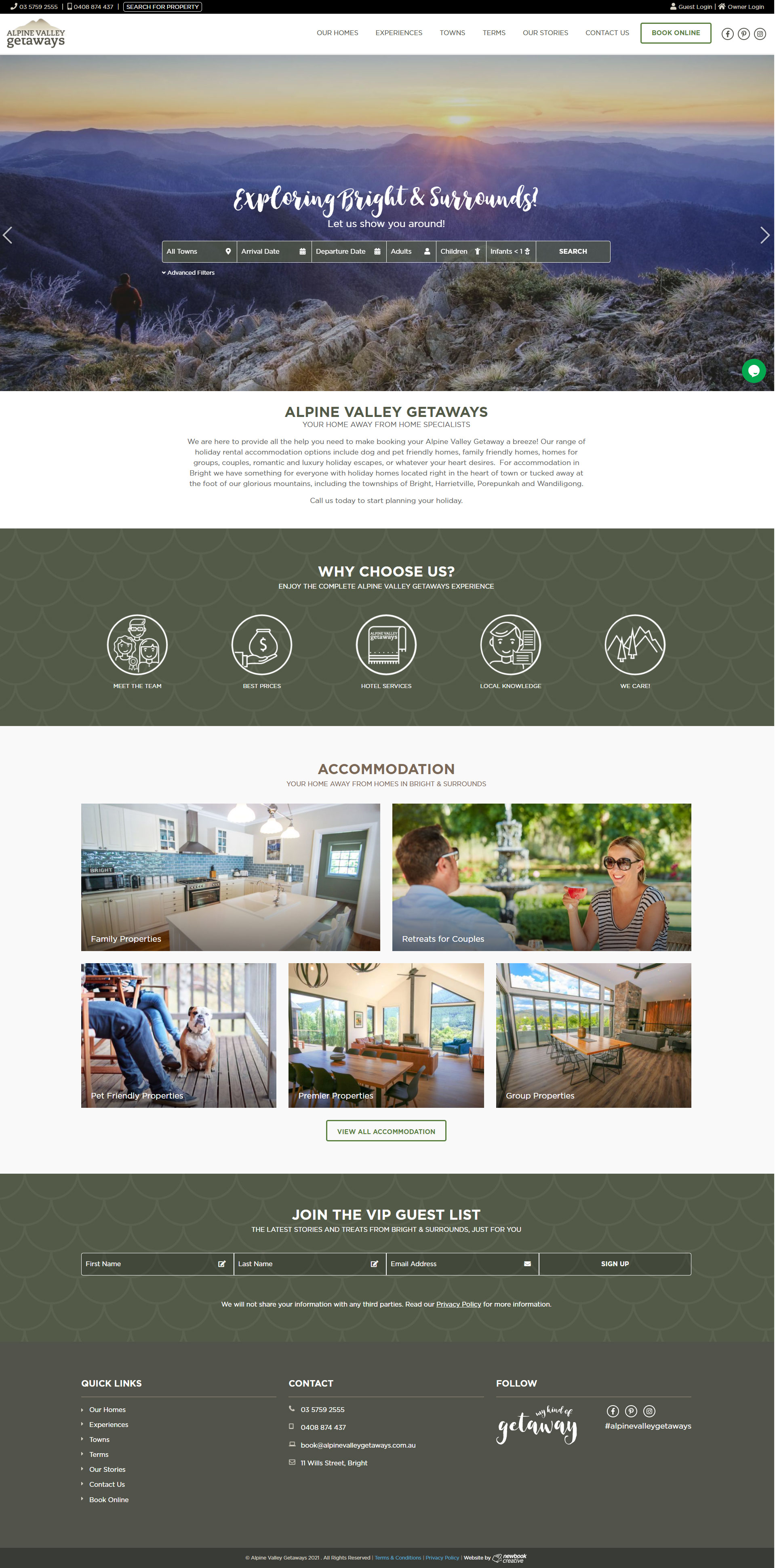
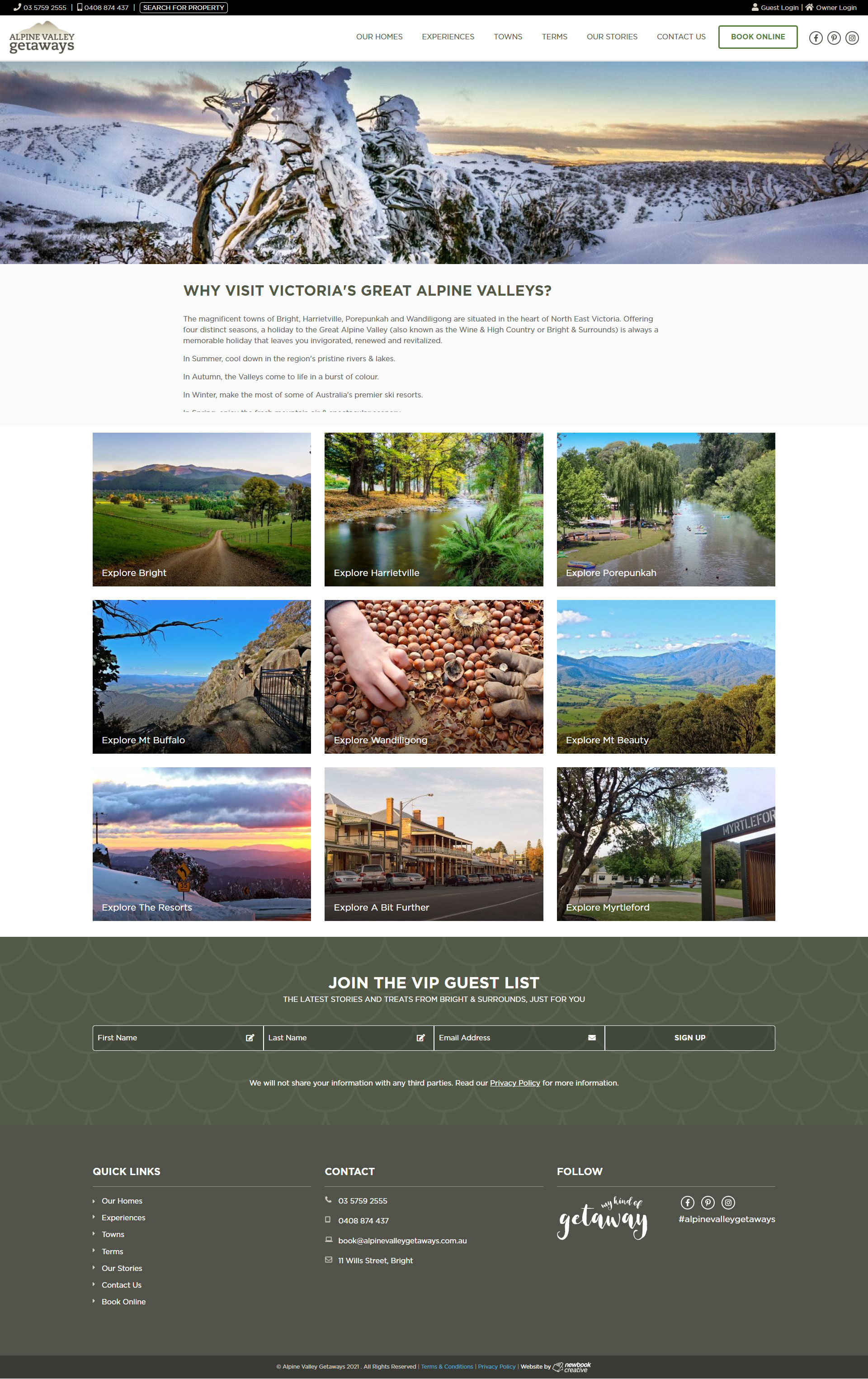
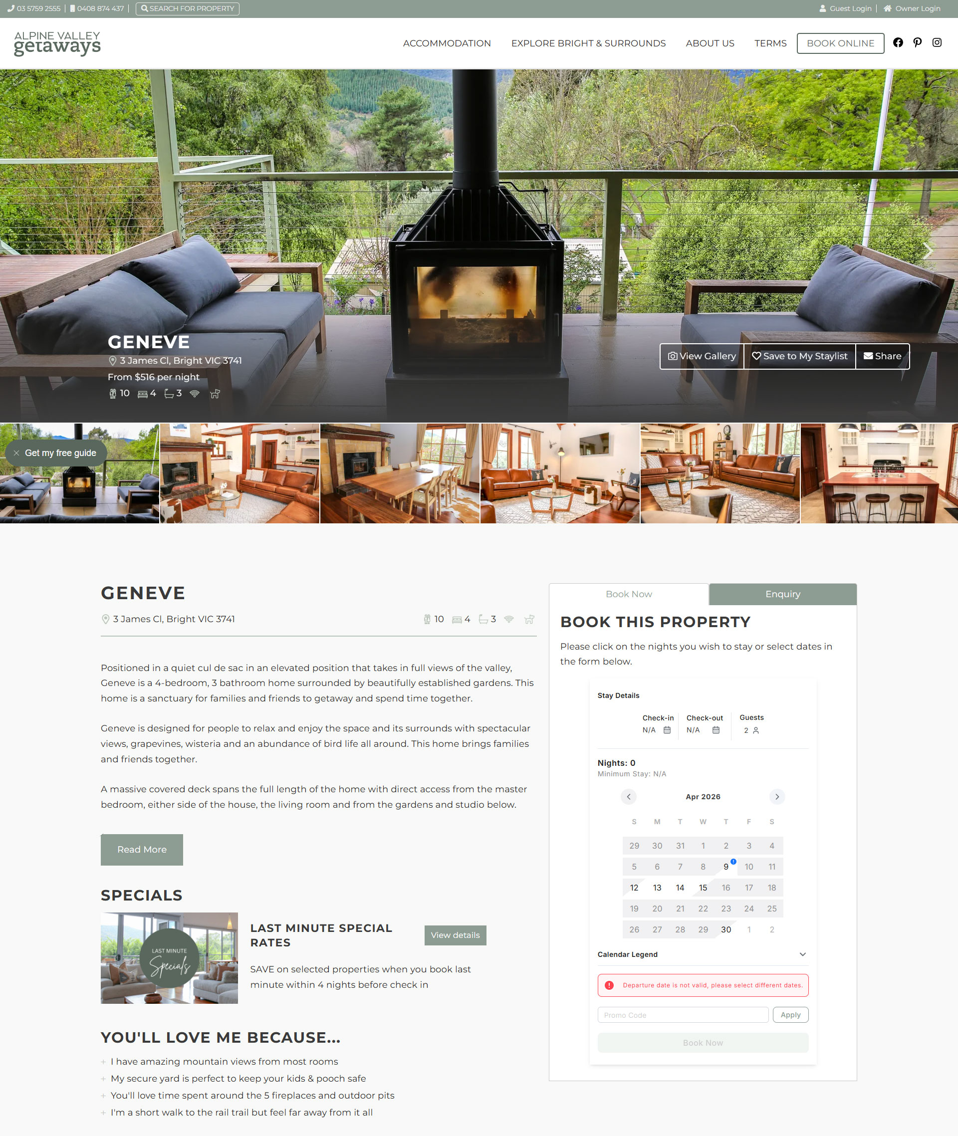
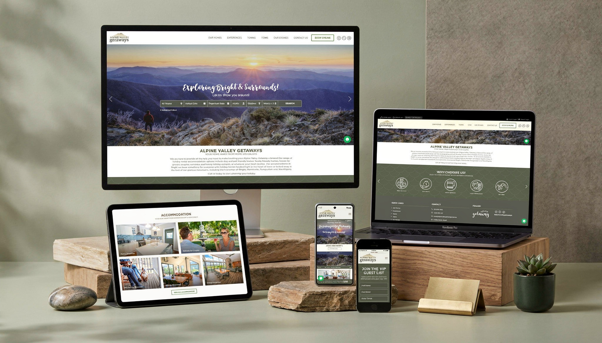
Alpine Valley Getaways is a booking and discovery platform for short-term stays in Victoria’s High Country. The goal was to create a site that feels calm, trustworthy, and easy to navigate while supporting real user intent: quickly finding and booking the right property.
This was a full end-to-end project where I owned UX, UI, and front-end development.
Most regional accommodation sites fall into one of two traps:
For Alpine Valley Getaways, the challenge was to balance both. The site needed to:
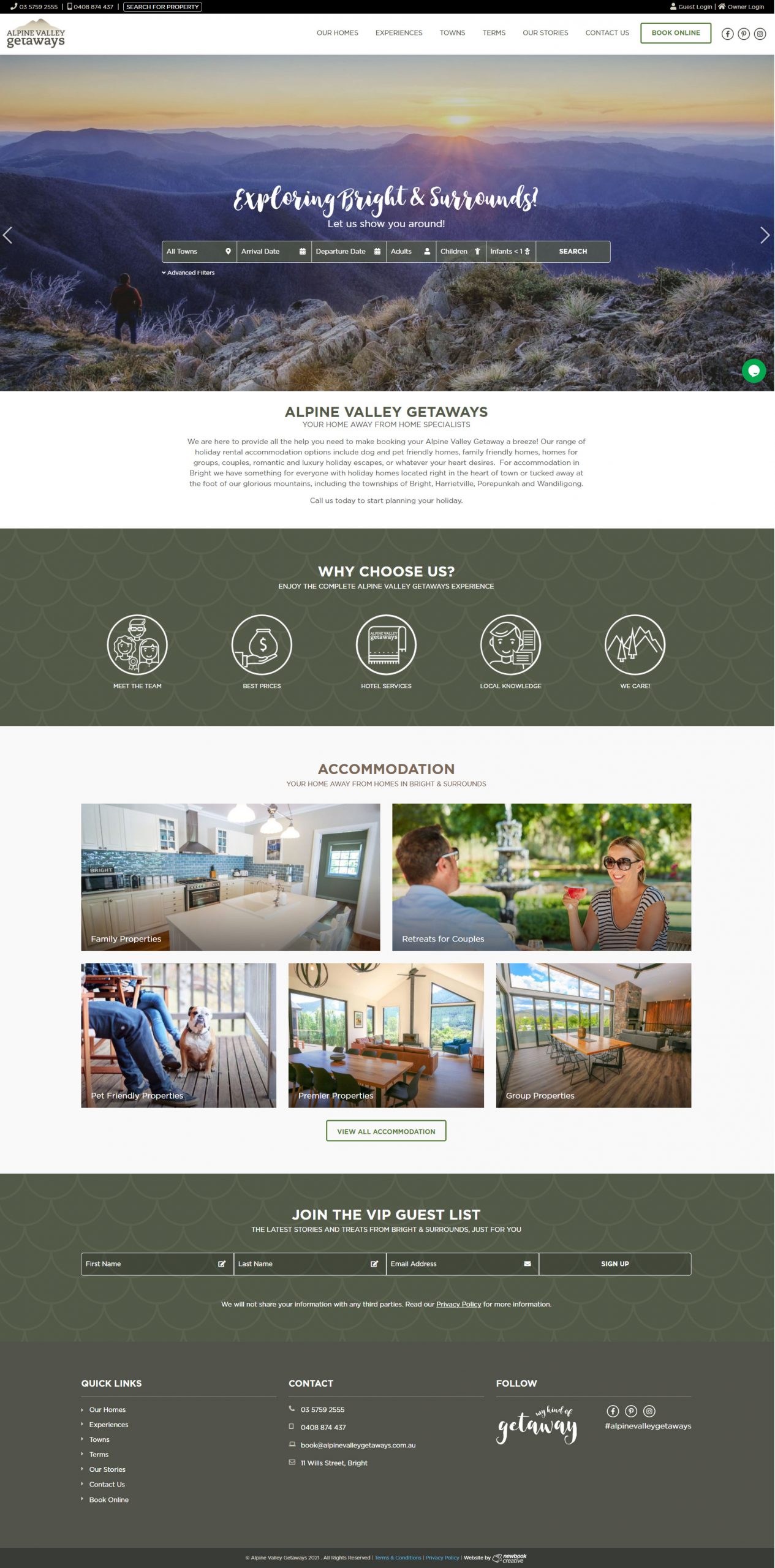
The core user journey is simple but high-stakes:
Users are typically time-poor and goal-driven. They are not exploring for long, they want to quickly validate whether a property fits their needs.
This shaped everything. Less decoration, more clarity.
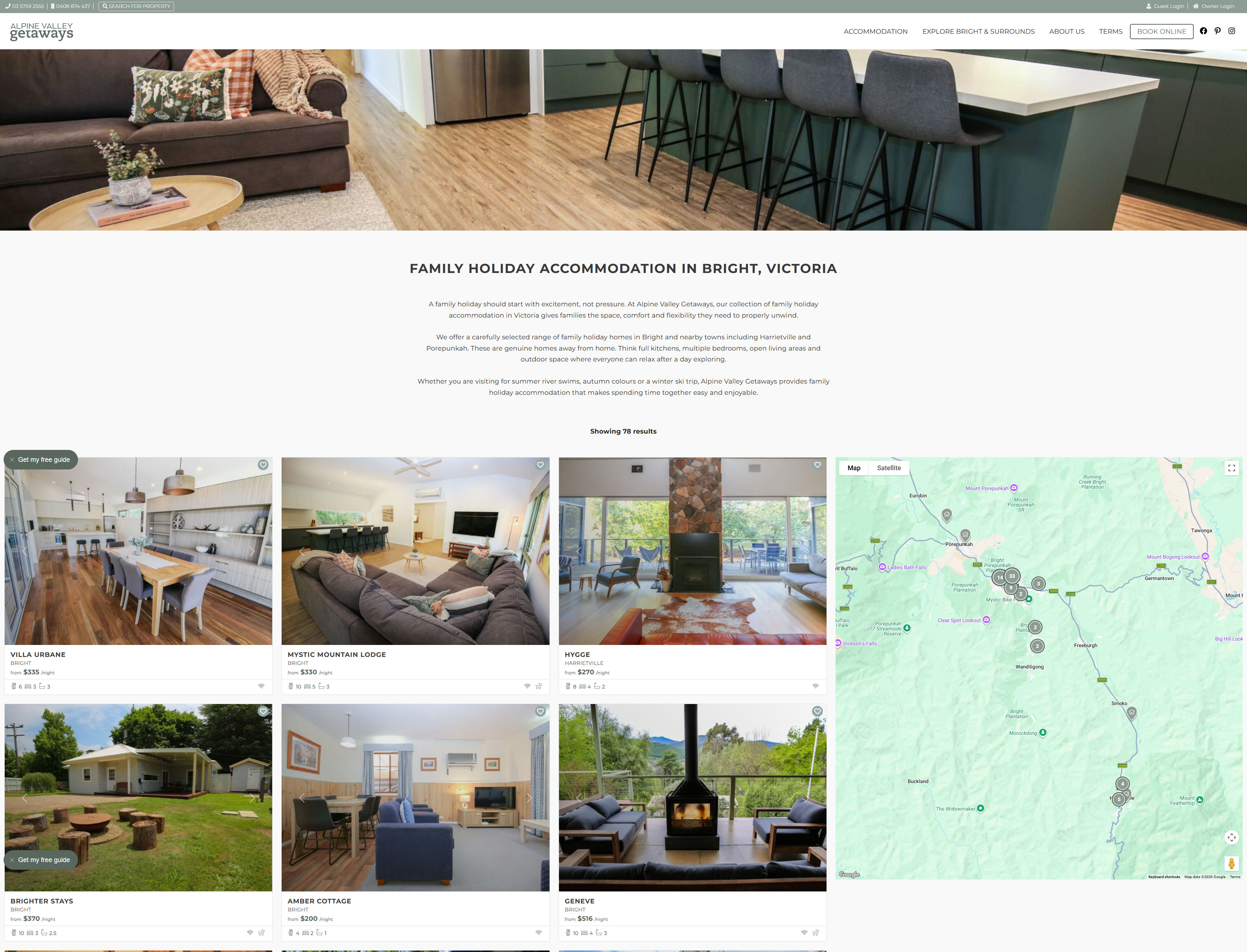
I focused heavily on what users actually care about when choosing a stay:
Each page is structured to answer those questions in order, without forcing users to dig.
The UI intentionally steps back to let the properties do the work.
The goal was to create confidence through presentation rather than noise.
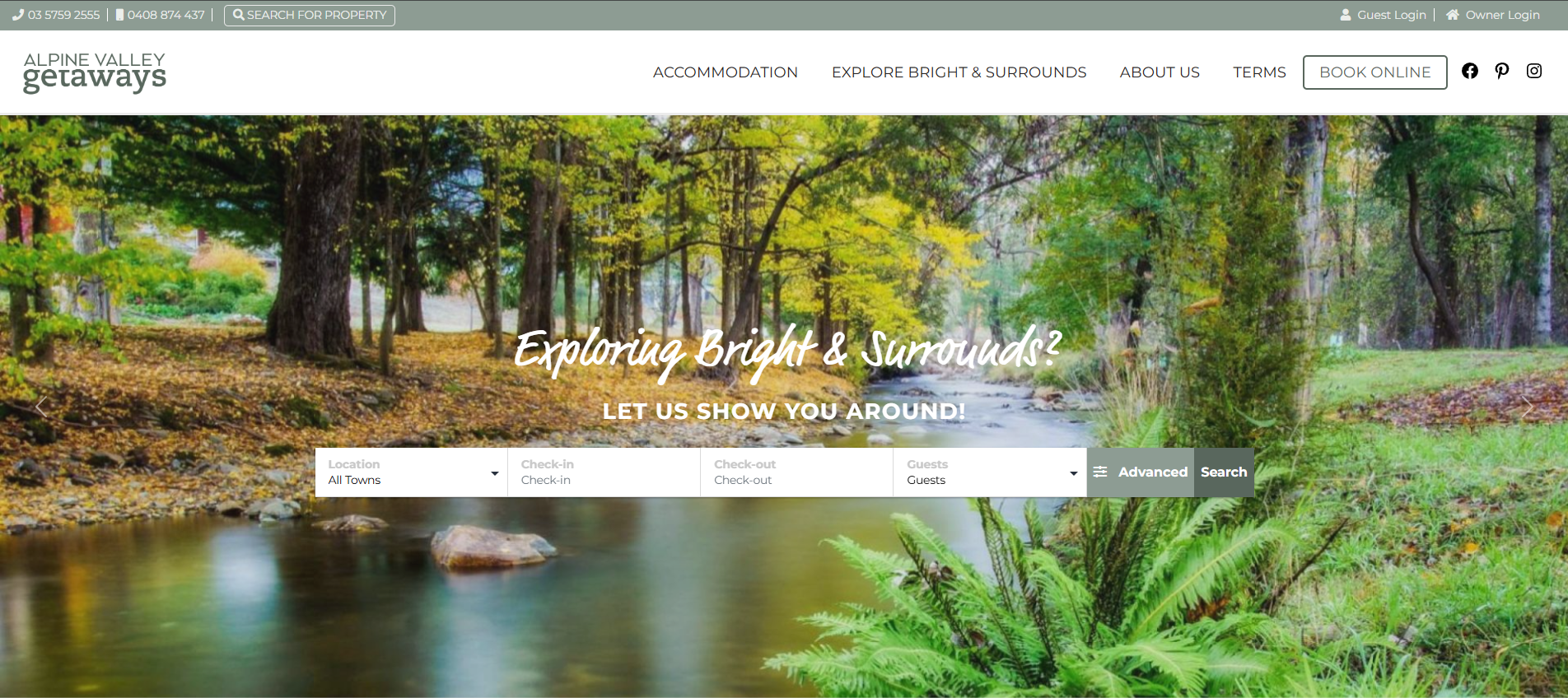
Navigation is kept simple and predictable:
I avoided complex filtering systems in favour of clarity and speed, based on expected scale and user behaviour.
I built the front-end to support both performance and flexibility:
The site is designed so non-technical stakeholders can continue to evolve content without breaking the experience.

This project reinforced how important restraint is in UX. It is easy to over-design booking experiences, especially when trying to differentiate. In reality, users just want clarity, speed, and confidence in their decision.
By focusing on hierarchy, simplicity, and solid front-end execution, the result is a product that feels intentional and easy to use, without needing to shout for attention.

I'm currently looking for freelance or Inhouse opportunities, my inbox is always open or alternatively can be contacted on Linkedin or Artstation. Whether for a potential project or just to say hi, I'll try my best to answer your message!