2018
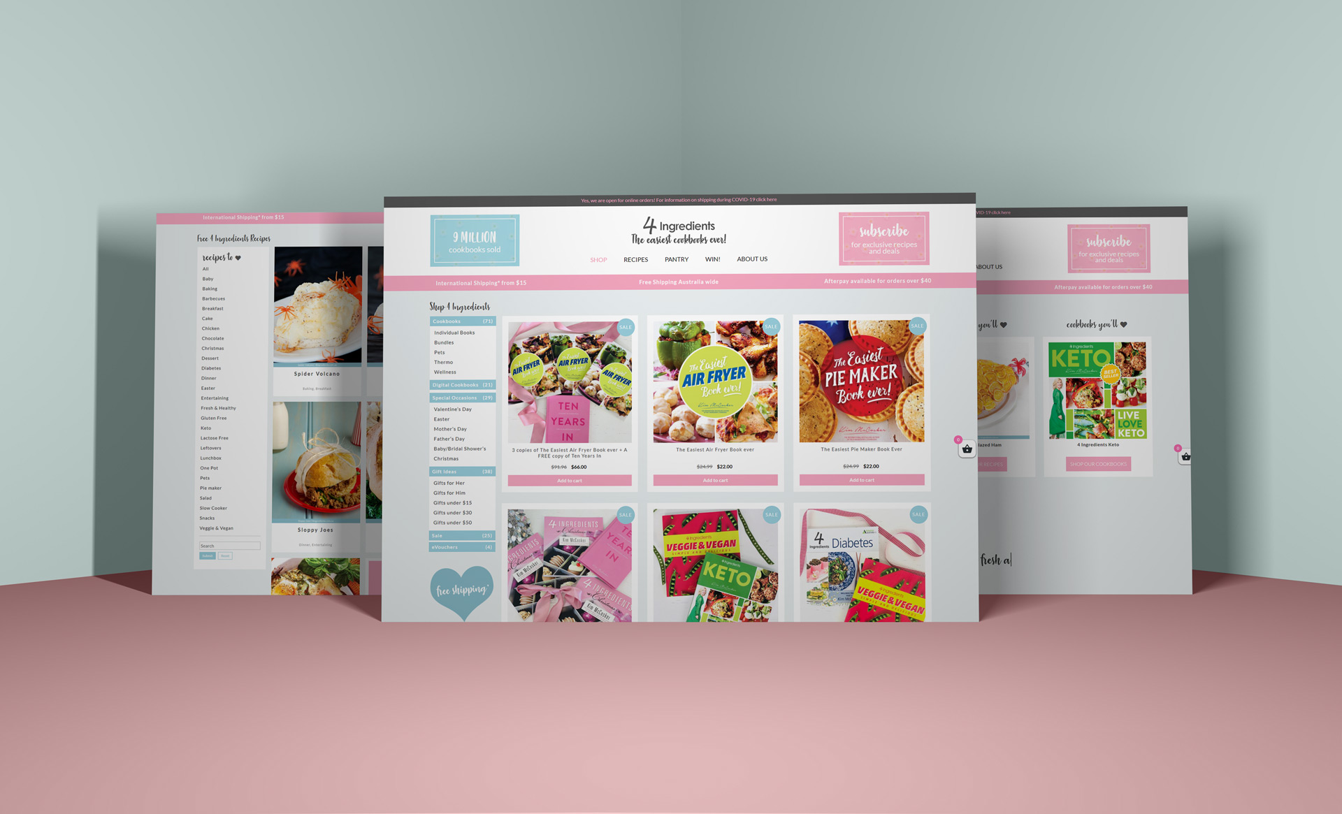
4 Ingredients is a cookbook brand and eCommerce platform built around a simple idea: recipes using four or fewer ingredients. The site needed to support both product sales and ongoing content like recipes, blogs, and community engagement.
The goal was to create a site that reflects the brand’s core philosophy, simplicity, clarity, and accessibility, while still functioning as a scalable commerce platform.
The brand itself is built on simplicity, but the product ecosystem is not:
- Multiple cookbooks across different categories
- Ongoing recipe content and blog updates
- A broad audience, from beginners to experienced home cooks
- eCommerce requirements layered on top
The challenge was to translate a very simple idea into a site that could handle complexity without feeling complex.
Create a frictionless path from discovery to purchase.
Make recipes and content easy to browse and return to.
Maintain a clear, approachable tone across the UI.
Support a growing catalogue of products and categories.
Ensure the experience works equally well for low-confidence users.
The brand already has a strong identity. The job wasn’t to reinvent it, it was to respect it.
Everything comes back to the core promise:
That meant removing anything that slowed users down or made decisions harder.
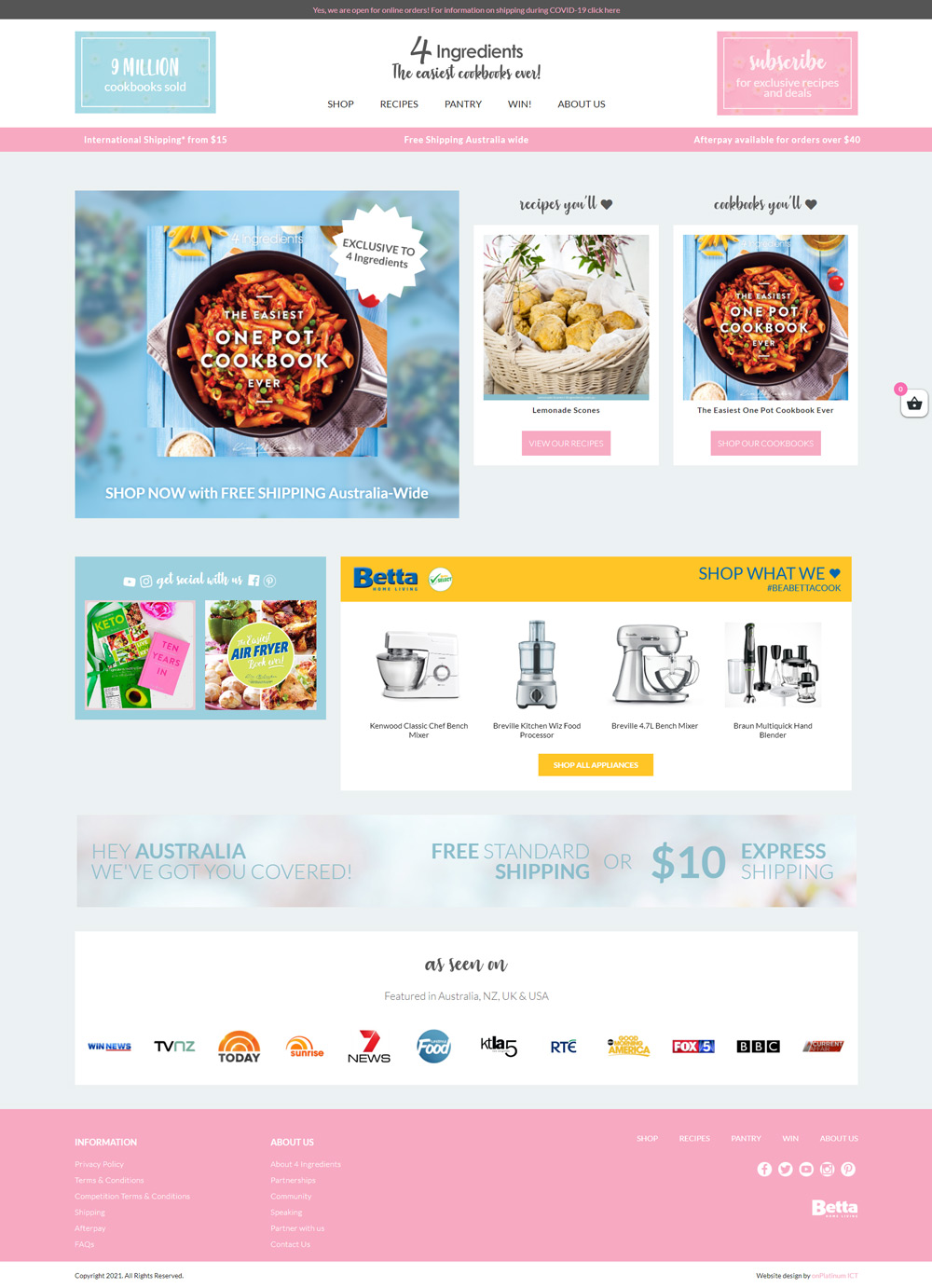
The site isn’t just a store, it’s a content platform.
Users move between:
Instead of separating these experiences, I treated them as part of the same journey. Recipes and content act as entry points, while products are integrated naturally into that flow.
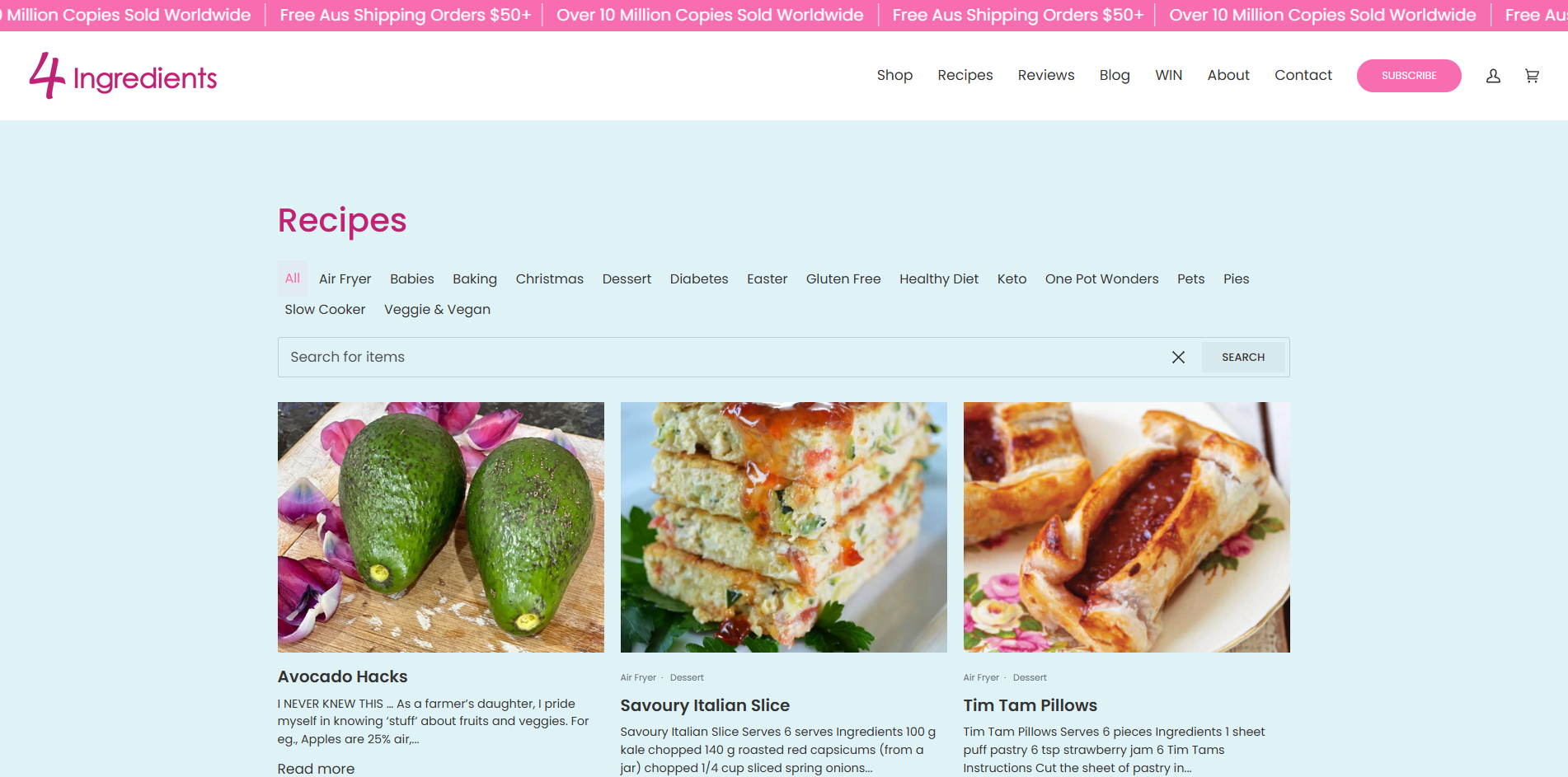
The navigation structure is intentionally straightforward:
This avoids over-segmentation and lets users move quickly without needing to think about where something “lives.”
The catalogue includes multiple variations of similar products (diet-based, cooking method, lifestyle).
To handle this:
This keeps browsing fast, even as the catalogue grows.
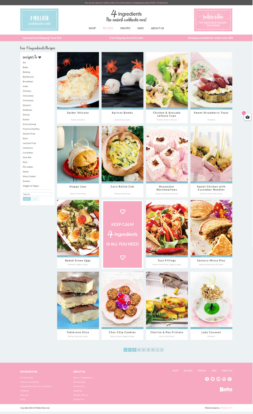
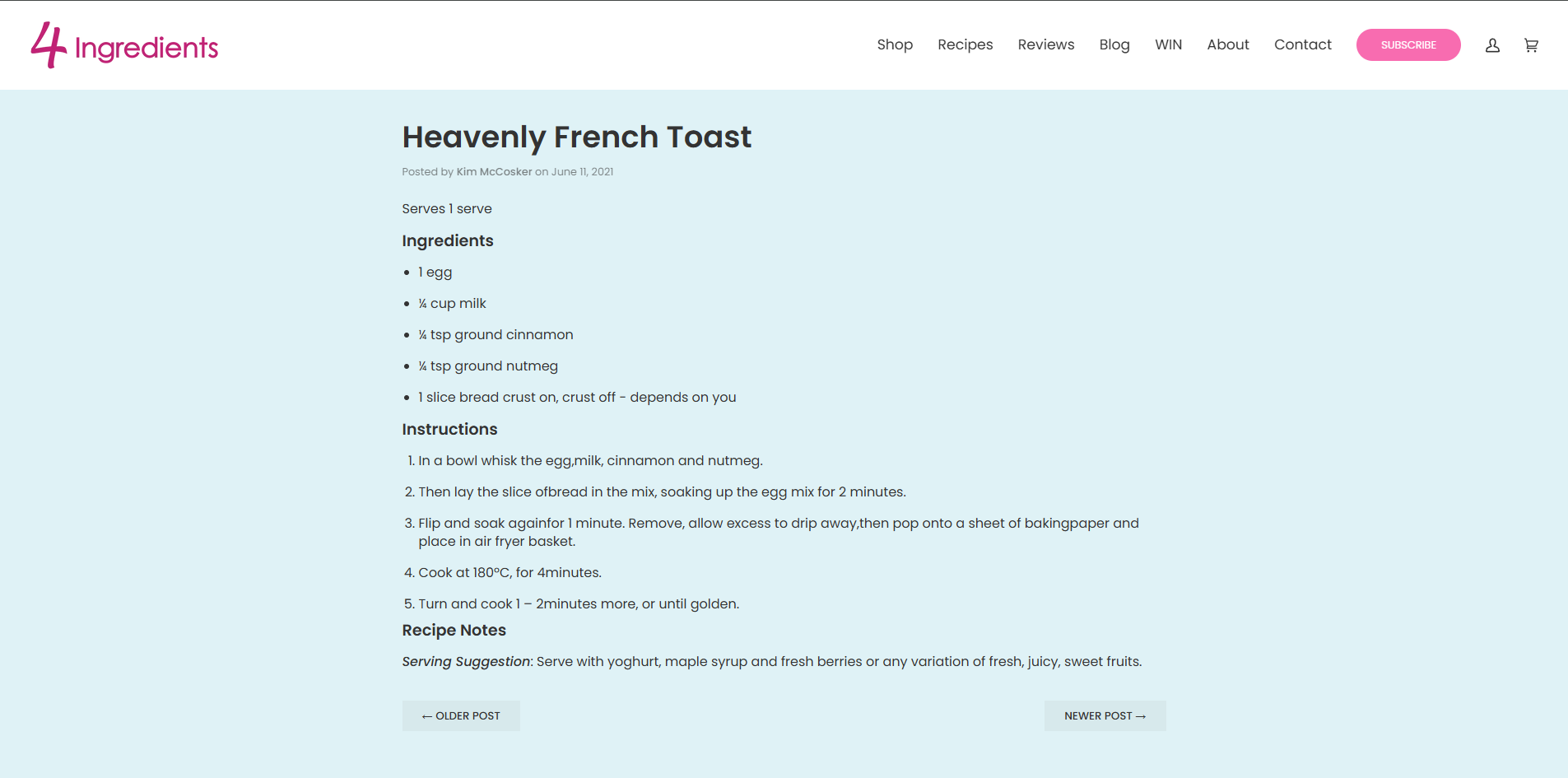
Recipes are a core engagement driver, not just supporting content.
Each recipe is structured to be:
This aligns directly with the brand promise of simplifying cooking. Recipes are written to be short and accessible, often using minimal ingredients and steps.
The site needed to support frequent updates without constant redevelopment.
I built the front-end to:
This reduces long-term friction for the business and keeps iteration fast.


Lean into familiarity
This is not a site where novelty helps. Familiar patterns reduce friction, especially for less tech-confident users.
Let content do the work
Recipes and products are the value. The UI stays out of the way and supports readability and clarity.
Design for repeat use
This isn’t a one-time visit site. Users return for recipes, so consistency and ease of navigation matter more than first-time impact.
Clear, accessible experience aligned with the brand’s simplicity.
Seamless flow between content and commerce.
Scalable structure for recipes, blogs, and products.
Reduced friction for both users and internal updates.
This project is a good example of where restraint matters more than expression. The brand already solves a real problem, making cooking easier. The site just needed to get out of the way and support that.
The challenge wasn’t making something visually unique, it was making something consistently usable across a wide audience, and making sure that still holds as the platform grows.
I'm currently looking for freelance or Inhouse opportunities, my inbox is always open or alternatively can be contacted on Linkedin or Artstation. Whether for a potential project or just to say hi, I'll try my best to answer your message!