2021
UI/UX Designer
2021
Adobe Suite, Google Analytics, HotJar, Wordpress
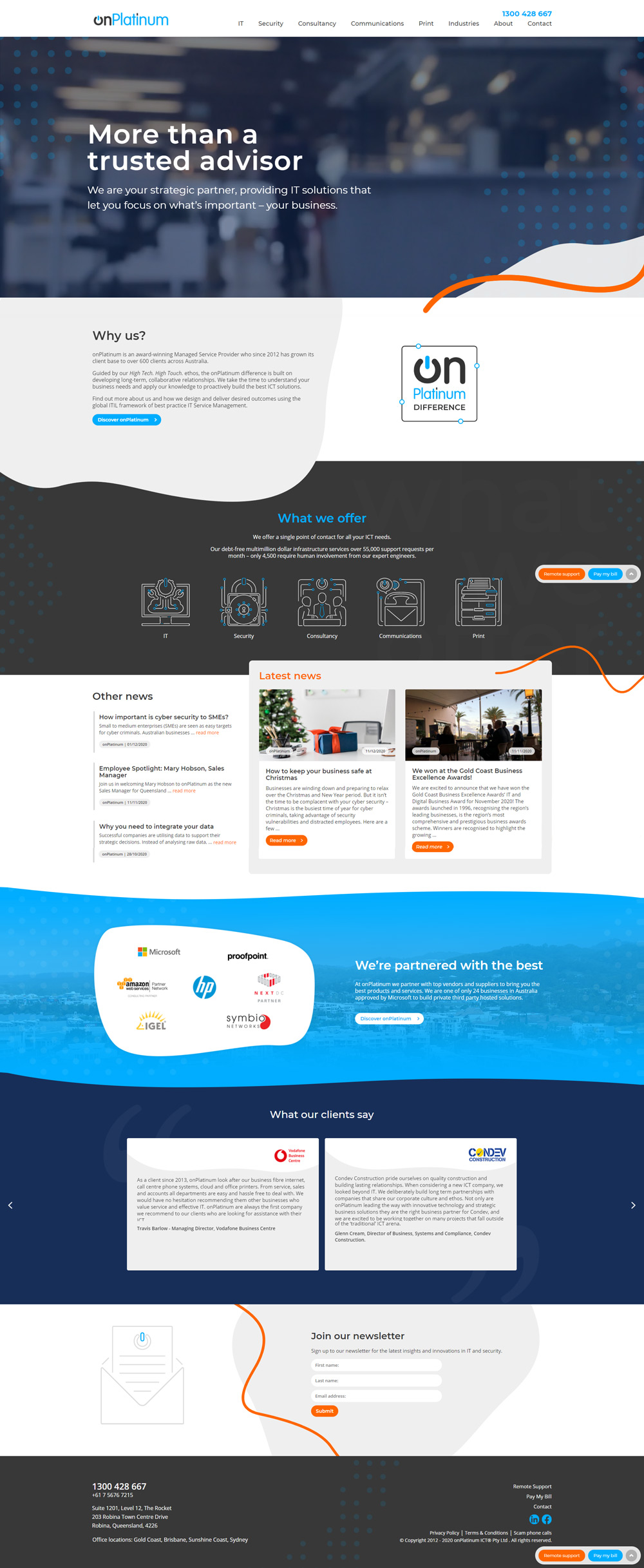
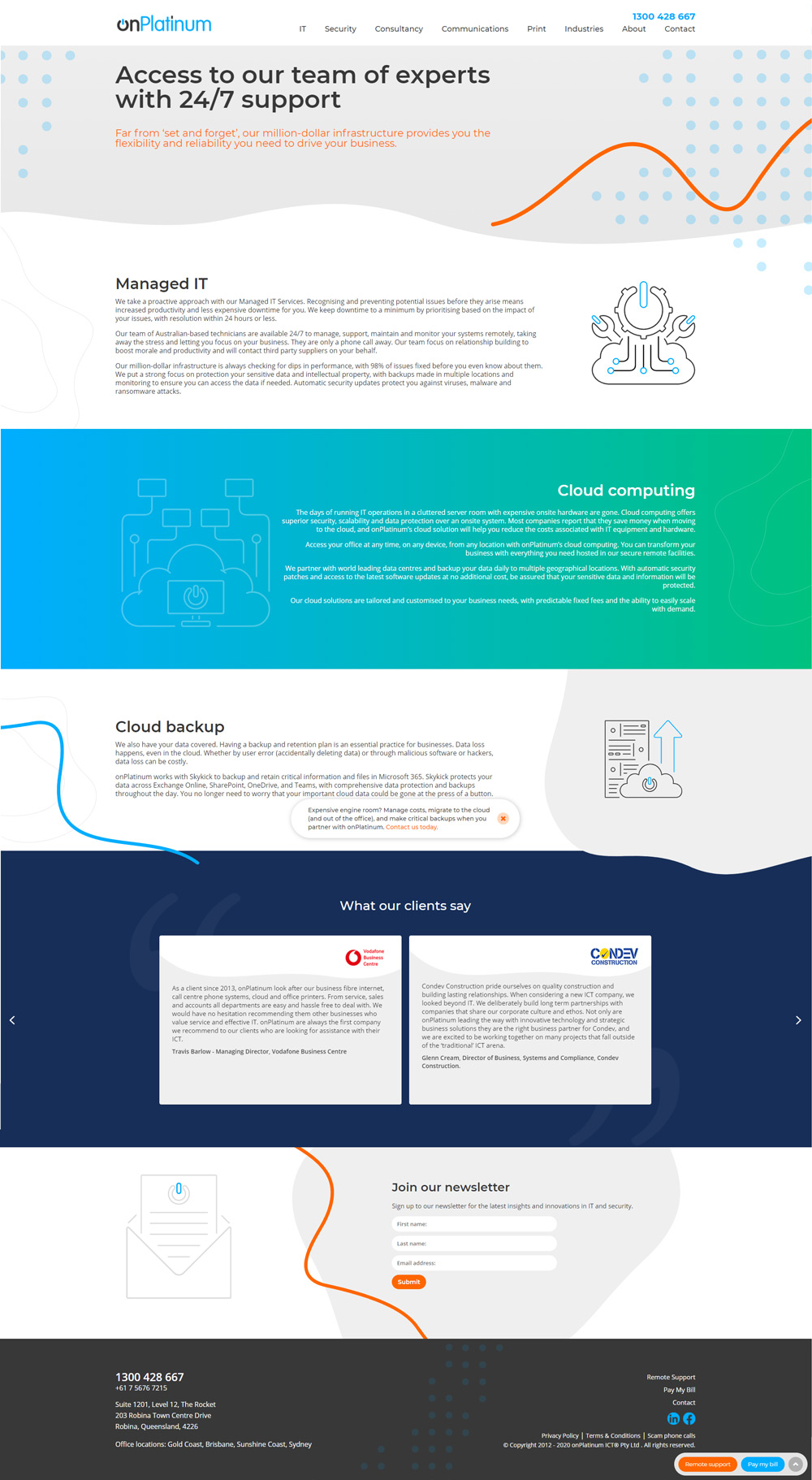
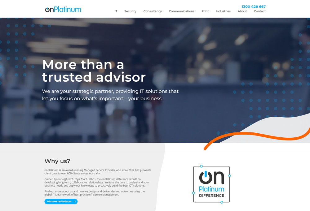
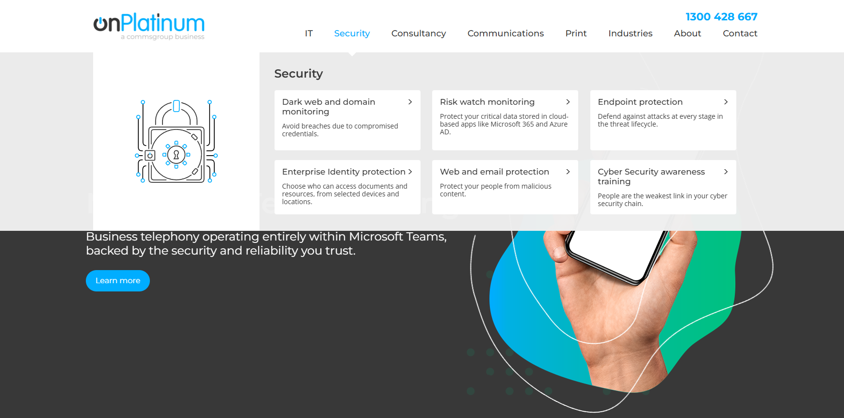
This project focused on redesigning the OnPlatinum website, which had not been updated since 2016 and was still relying on outdated branding and structure. Over time, the company had expanded the range of products and services it offered, but the website had not evolved alongside the business. As a result, key offerings were difficult to discover, and the overall user journey lacked clarity.
The primary challenge was not just visual refresh, but structural. The site needed a clearer information architecture that reflected the company’s current positioning, guided users to the right solutions, and supported multiple product paths without overwhelming them. At the same time, the experience needed to feel modern, trustworthy, and aligned with the updated brand direction.
Working with the team, the goal was to rethink the site from the ground up. This meant defining a clear user journey, restructuring how products were presented, and delivering a design system that balanced clarity, flexibility, and visual impact. The outcome needed to support both current users and future growth, ensuring the website could scale as the business continued to evolve.
Using Adobe XD, Photoshop, and Illustrator, I designed and iterated on wireframes that modernised the website and redefined the overall structure of the experience. The focus was on simplifying how users navigated the site while clearly presenting the company’s expanded range of services. These wireframes established a strong foundation for both visual design and content hierarchy.
A new, intuitive navigation system was designed to help users quickly identify and access the services most relevant to their needs. This reduced friction and ensured users could move through the site with minimal effort, regardless of their entry point.
To add visual interest without compromising performance, lightweight SVG animations were introduced. These were used selectively to draw attention to key services and transitions, enhancing clarity and engagement while maintaining fast load times.
Updated branding and visual assets were applied throughout the site to create a cohesive and modern look that aligned with the company’s refreshed identity. This helped unify the experience and ensured consistency across all pages.
Throughout the process, I worked closely with the marketing team to ensure the site was structured and optimised for search. This included aligning content hierarchy, page structure, and keywords to support discoverability. As a result, the site achieved strong visibility and became a top search result for ICT solutions in Australia.

The website overhaul was met with strong positive feedback from both stakeholders and users. The updated experience made it easier for new clients to understand the company’s offerings, while giving existing clients a clearer and more intuitive path to services they had previously struggled to find or fully understand.
From a business perspective, the improved clarity and navigation helped attract new clients while reinforcing trust with existing ones. The site better reflected the company’s capabilities and positioned its services more confidently, supporting ongoing growth.
On a personal level, the project also represented a period of growth. I deepened my skills in motion design and UX while helping establish a new visual direction that the team was proud to stand behind. The result was a modern, scalable website that balanced usability, performance, and brand expression.
I'm currently looking for freelance or Inhouse opportunities, my inbox is always open or alternatively can be contacted on Linkedin or Artstation. Whether for a potential project or just to say hi, I'll try my best to answer your message!