2021
This project focused on redesigning the Inkpay website, where I led UI and UX across the full lifecycle of the product. I worked closely with engineering and stakeholders to define and refine the user flow, grounding decisions in research into real user pain points and behavioral data.
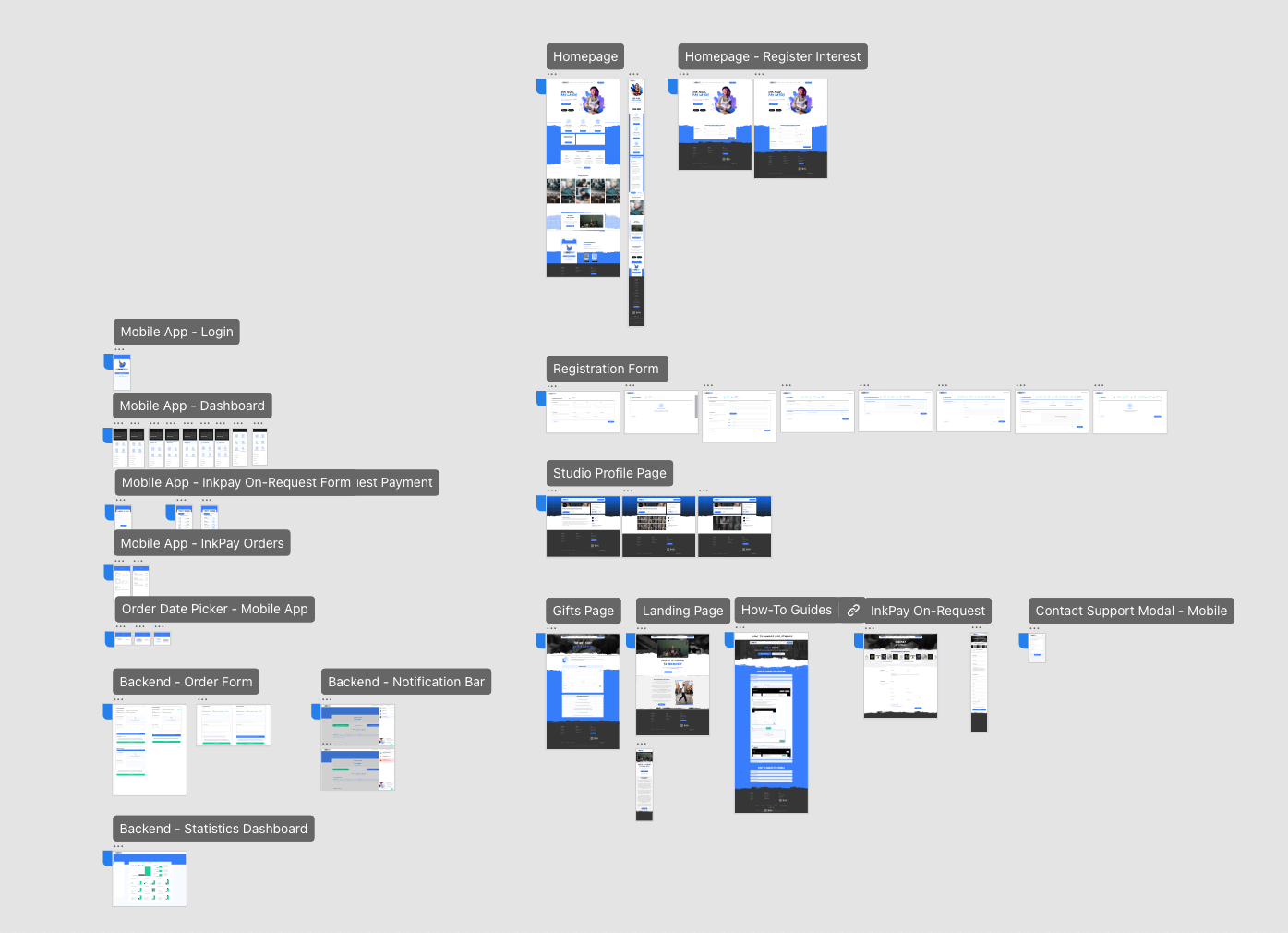
The work included conducting exploratory research, translating findings into wireframes and interactive prototypes, and iterating through regular reviews with management and the development team. Once aligned, I delivered production-ready assets and a component library to support consistent implementation.
After launch, I continued to evaluate the live product, using data and feedback to make targeted adjustments and improvements. This ensured the experience evolved based on real usage rather than assumptions, and remained aligned with both user needs and business goals.

Because Inkpay operated as a SaaS platform, research needed to account for multiple user types with different goals and constraints. This included end users seeking financing, studios managing clients and payments, and internal stakeholders overseeing approvals and financial flow. The challenge was designing an experience that served each audience clearly without introducing friction or unnecessary complexity for the others.
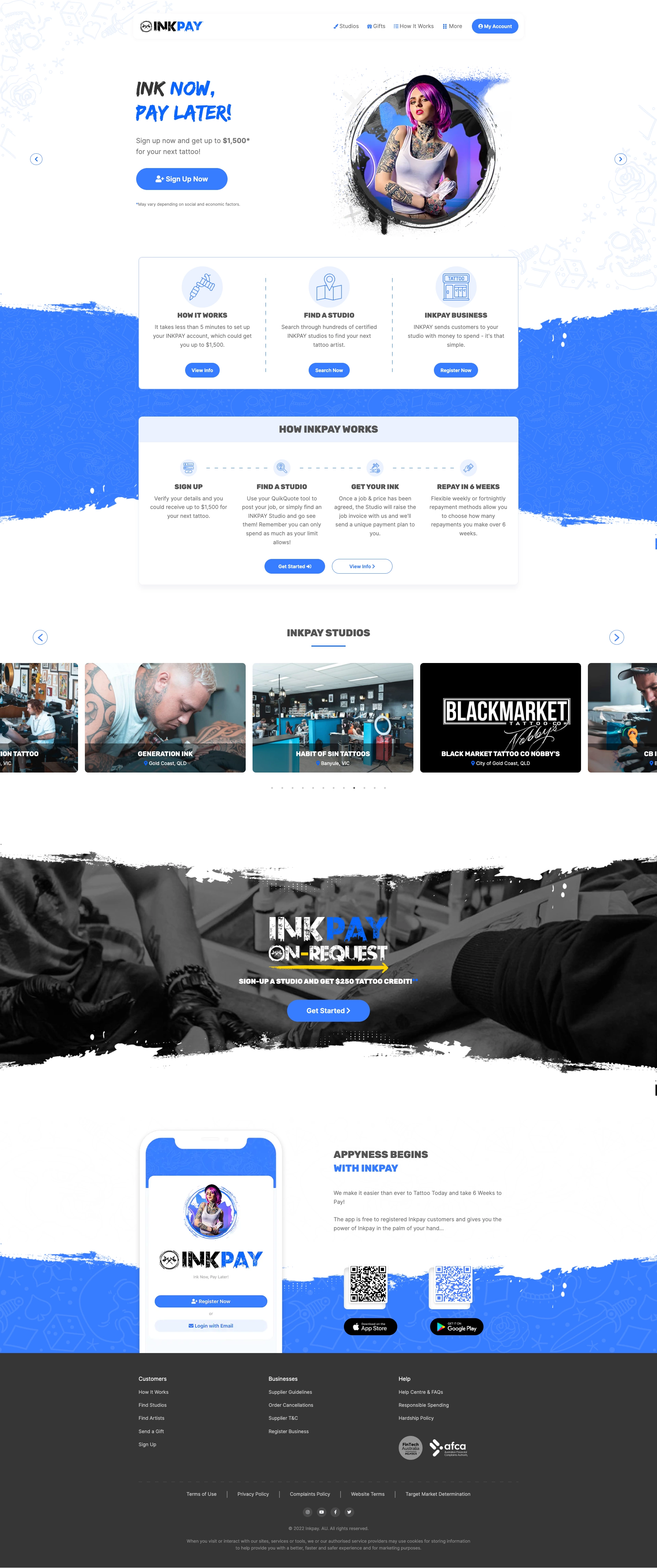
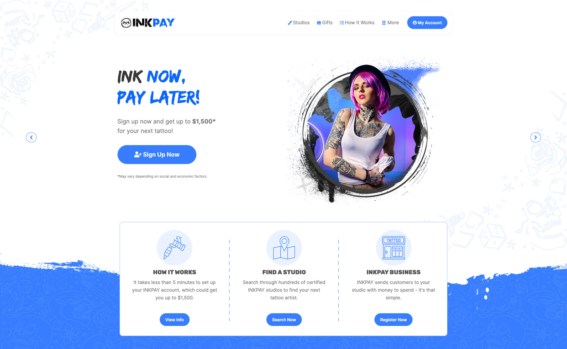
Early work focused on defining the core flows required for the platform. This included a multi-step signup and login experience, as the product involved lending money to users booking tattoo artists. In parallel, we designed dashboards that allowed users to view balances and repayments, studios to manage clients and bookings, and internal teams to approve accounts and monitor platform activity. Each flow was mapped end-to-end to ensure clarity, compliance, and ease of use.
Using Adobe XD, I built interactive prototypes alongside a shared component library. This allowed the design to evolve through multiple iterations while maintaining consistency and speeding up changes as feedback came in. Establishing the component library early was key to defining the new visual direction of the site and keeping the experience cohesive as scope expanded.
We used Jira to plan and prioritise features, which helped keep the work structured and transparent across design and development. Close collaboration with engineering meant questions, edge cases, and implementation challenges were addressed quickly, often through additional mockups or flow clarification rather than assumptions.
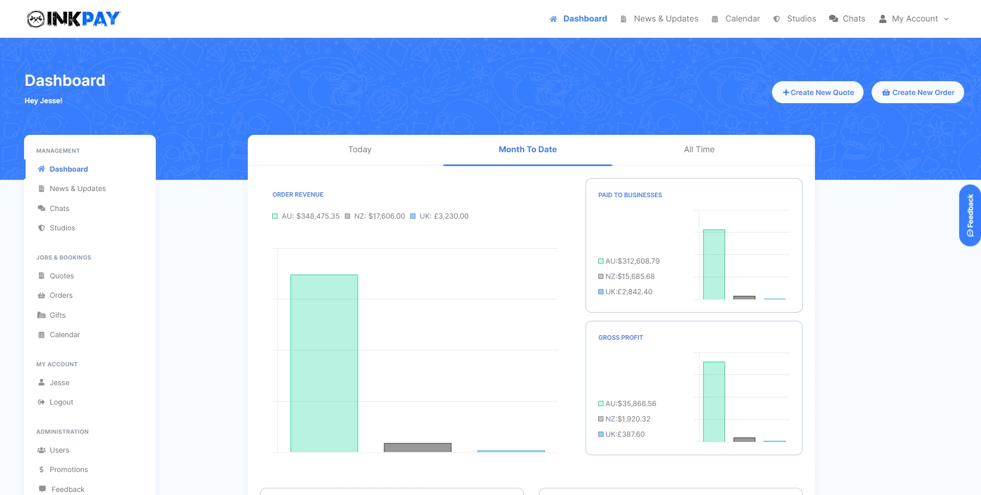
Strong planning and cross-functional communication allowed the team to stay focused while still accommodating change. As the platform matured, we introduced data visualisation into the studio and admin dashboards, giving studios visibility into performance over time and providing stakeholders with insight into overall platform health and money flow.
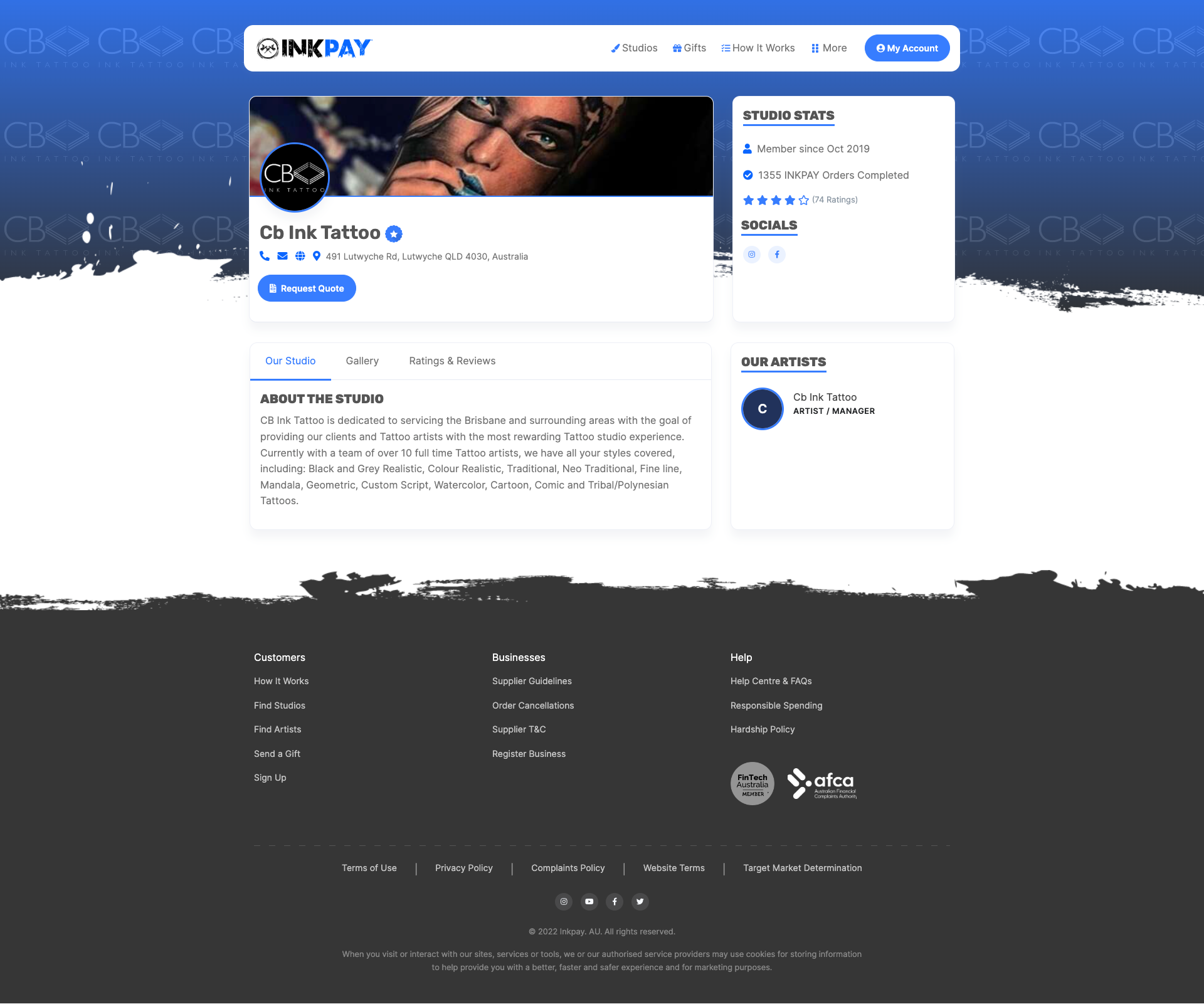
We also redesigned studio profile pages to give studios greater control over their public presence. These pages surfaced ratings, past client reviews, social links, and galleries of previous tattoo work, helping build trust with potential clients and supporting informed decision-making.


One of the most critical improvements was to the verification and sign-up experience for both users and studios. Previously, many users abandoned the process partway through due to unclear instructions and a lack of visibility into what was required. By streamlining the flow, clarifying expectations at each step, and clearly communicating progress and remaining steps, users were better supported throughout the process. We also introduced clear support touchpoints for moments where users might get stuck.
Recorded user journeys showed a marked improvement after launch. Users were able to complete the process with confidence and continue past stages where drop-off had previously occurred. This change also resulted in a noticeable reduction in support tickets related to sign-up and verification.
Navigation improvements had a similarly strong impact. Prior to the redesign, users frequently exited the site after two or three pages due to difficulty finding relevant information. With clearer navigation and explicit differentiation between User and Studio paths, visit time and click-through rates increased. Users were more likely to find the studios or information they were looking for, while studios consistently landed on the appropriate registration flow.
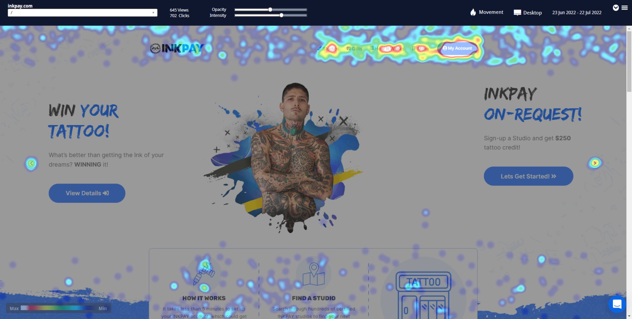
Post-launch, the platform continued to evolve. Working alongside the development team, we introduced features that strengthened the connection between users and studios. One such feature was Inkpay On-Request, which allowed users to invite their preferred studio to join Inkpay. This feature quickly became a valuable acquisition funnel, supporting sales and support teams in onboarding new studios.
Inkpay On-Request had been used thousands of times, reinforcing the impact of designing flows that align user intent with business outcomes.
I'm currently looking for freelance or Inhouse opportunities, my inbox is always open or alternatively can be contacted on Linkedin or Artstation. Whether for a potential project or just to say hi, I'll try my best to answer your message!