
Inkpay Website
Lead UI Designer
As the Lead UI/UX designer on this project, I led the design and liaised with the development team while researching and building the new user flow. I did extensive research into the issues the general user was having, created wireframes and prototypes while including management and the development teams feeback. I delivered final assets and component libraries, showcased the live product and made adjustments according to the live data.
Project Details
Challenges
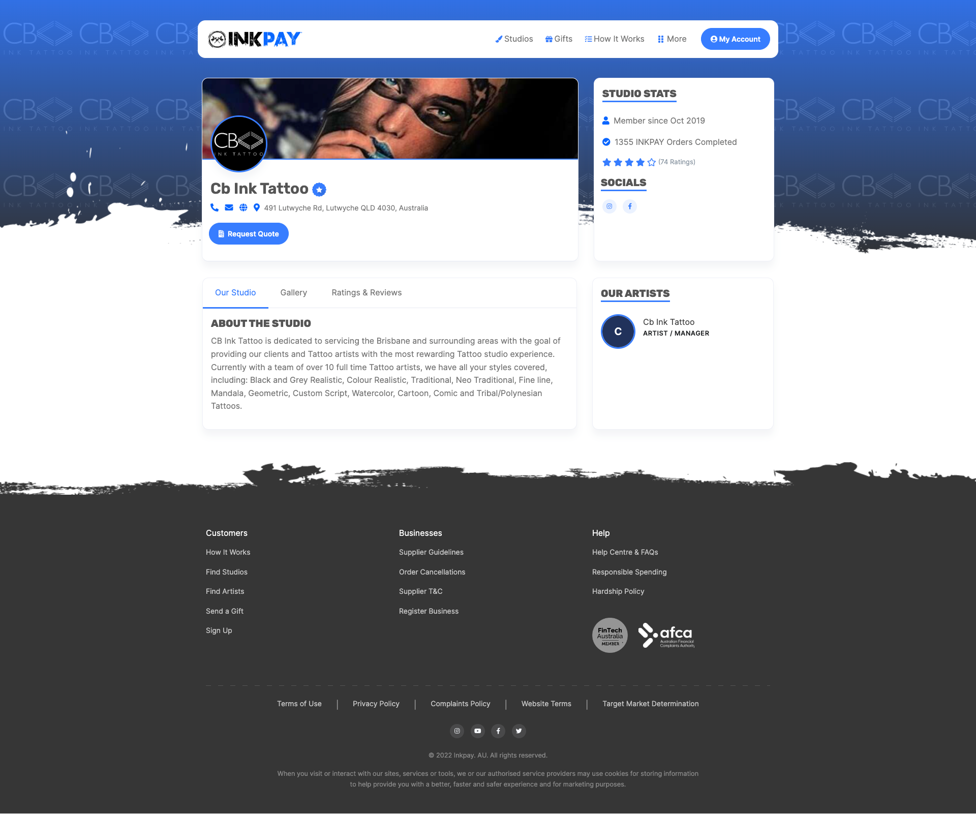
- Website was harder to navigate then it needed to be.
- User Forms had resposive and flow issues causing sign up abandonment.
- Navigation needed to be more user friendly.
- Studio and User flows needed an update.
Objectives
- Gather User and Studio Feedback.
- Using Adobe XD, create wireframes.
- Research other similar sites for inspiration.
- Prototype new screens and navigation.
Solution
Using Adobe XD, the prototype of the website started to be built along with the component library. This was a key element in creating the new look and feel for the website after building on several different versions of an initial design.
Using Jira, we were able to plan out each feature and build, putting priority on each item. This was a great process to be a part of as the development team had a great line of communication with me when one of us would get stuck or needed more mockups/information for a certain feature.
Being part of a well organised team, planning out pages, content and features, helped keep this project on task and as a result build a better product.
Conclusion
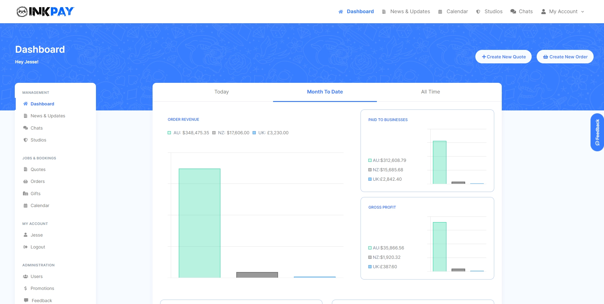
As a User and Studio on Inkpay, you have to be verified before you can request an order or accept an order, one of the pain points of the site previously was the Customer or Studio quitting half way through to form due to unclear instructions and a lack of details. We streamlined the form to be easier to understand, be clear about what you need, how many steps you have left and an easy way to contact support if you get stuck.
The results were great to witness through the recorded user journeys, seeing the user clearly understand what was required and continue passed where users previously would quit. This also resulted in less support tickets for the sign-up process now that it was more user friendly.
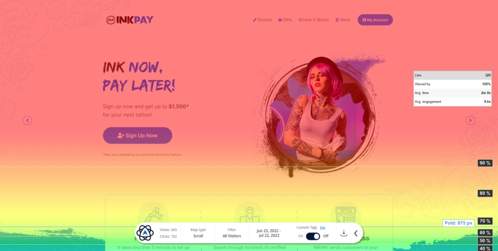
Previously, it was common for a lot of INKPAY users to quit 2 or 3 pages in due to not being able to find what they were after.
With the new navigation on display and with a clear indication of who each page is targeting (User/Studio), we saw a much higher site visit time and click rate which meant Users would find their desired studio or information they were after and Studio's would usually land on the "Register Business" page.
After the launch, me and the development team continued to launch features that helped users connect to the studios.
One of these features being "Inkpay On-Request" which allows the User to send a request to their favourite Studio to join INKPAY, this helped serve as a funnel for the Sales and Support team to then reach out to the Studios to get them onboard. To date this feature has been used by Users hundreds of times and continues to be used daily.
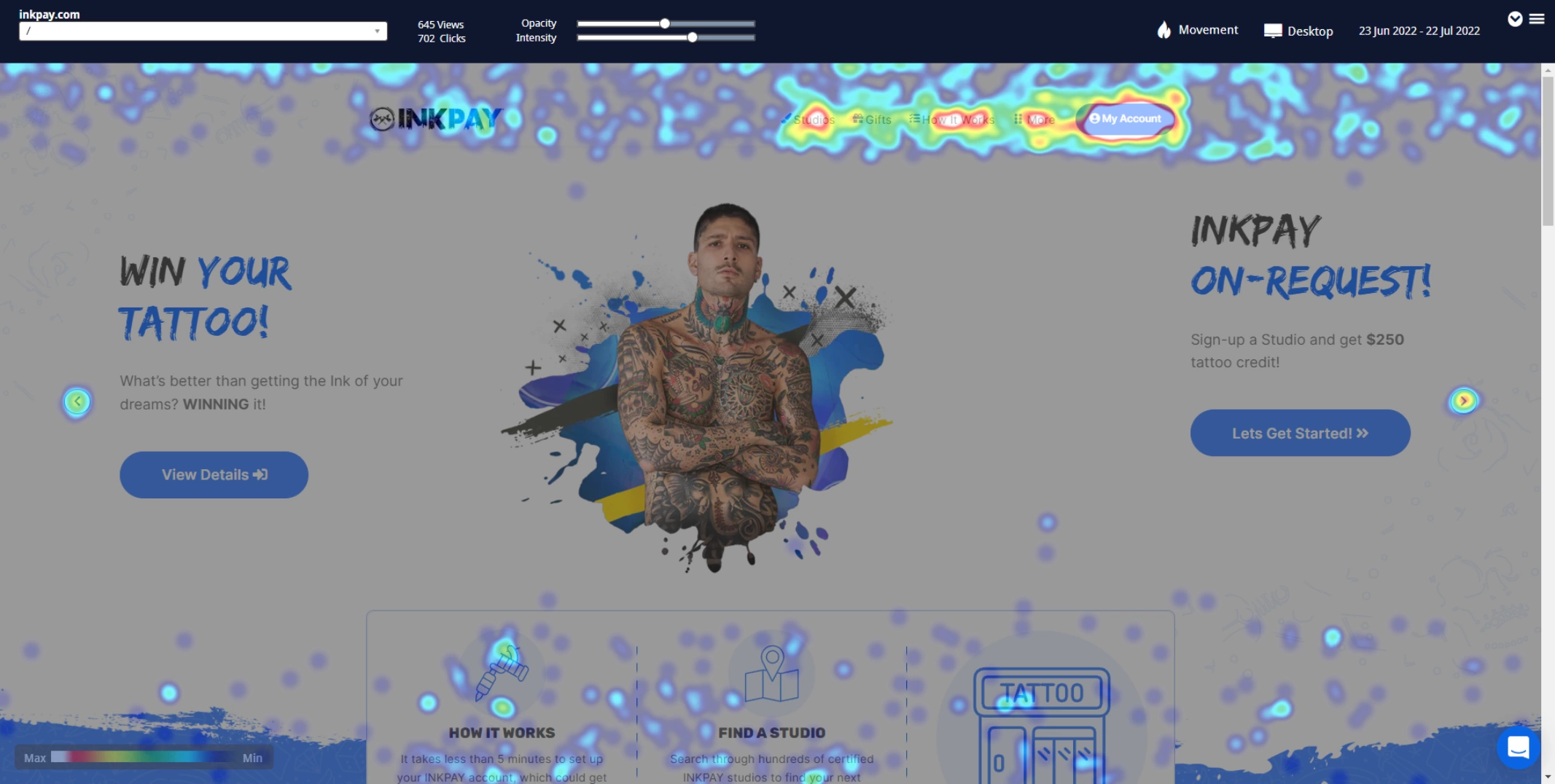
Gallery

.svg)