
Shardbound Card Upgrade
Lead UI/UX Designer
Working with Bazooka Tango, we designed and developed the card upgrade system shown in-game today. I was the lead UI/UX designer on this project.
Project Details

Challenges
- No current system available in the game.
- Limited user feedback as game was still in pre-alpha.
- Card Art and Frames were still a WIP.
- No clear path to upgrades (currencies, XP, balance)
Objectives
- Work with Game Lead and Project Manager to flesh out card system.
- Make a beneficial system to upgrade cards spending earned or purchased currency.
- Make UI for both Card and Game for the Upgrades to show.
- Understand User Journey and pain points for user by running a beta for Card Upgrade system.
Solution
Work with the team and research games across several different genres to see how they had tackled the upgrade system and how it could work for Shardbound.
Brainstorm and Workshop to find out how these upgrades will affect the cards via artwork, stats and implement a level up system on the card. From there, create wireframes and UI artwork created from our research to hand off to developers to implement.
Once this is done, we will do internal testing and prepare to release to a small amount of players to give feedback and suggestions on.

Conclusion
After finalising the card artwork with a newly added banner to show the current card level, we created the user journey for the card upgrade system and screens.
Once we had wireframed and created the screens from the user journey, we ran several internal play sessions internally and had already found where we could have it be more exciting and give the user a dopamine hit with each upgrade via adding extra VFX.
After this was added, we ran a small Beta with around 100 players for feedback and suggestions and came back with some very good ideas on how we can improve certain paths through the upgrades and where users were having trouble understanding what they can and cannot use for uprgrades. From this feedback, we gave a clear understanding on each screen on what was needed (extra cards, currency etc.) and reiterated the design to make it take less steps to make upgrading a quicker more satisfying experience.
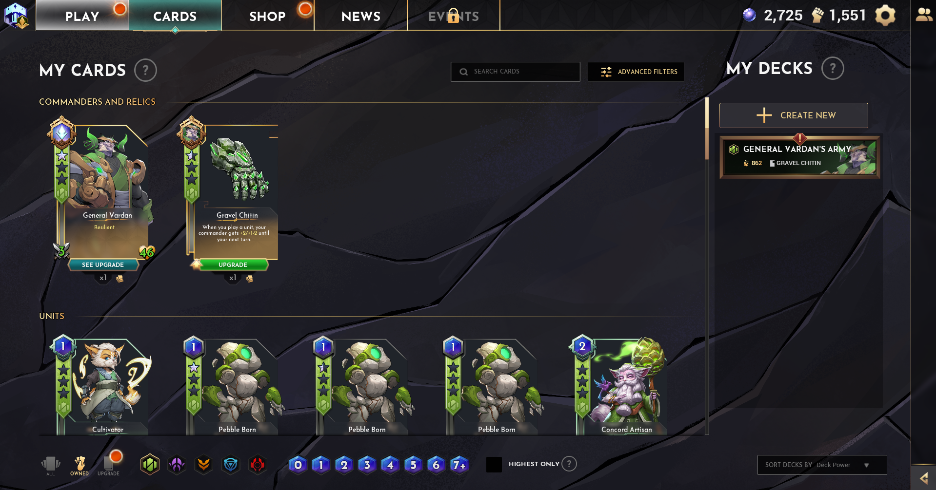
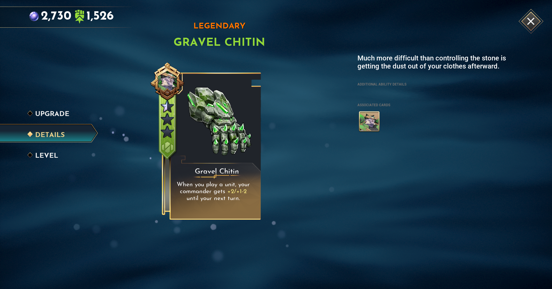
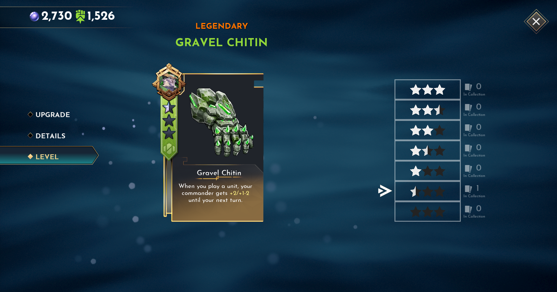
The screens you see in the Gallery below will show where it began to where it ended up while the UI and Card Artwork was being updated during implementation of the Upgrade system.
Gallery

.svg)