
Glamourpay App
Lead UI/UX Designer
To go along with the new website, the business also needed an App for both Android and Apple. They needed a nice clean design but not too complicated due to it being coded in NativeScript and having to adhere to the limitations that brought.
Project Details
Challenges
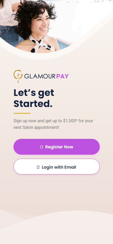
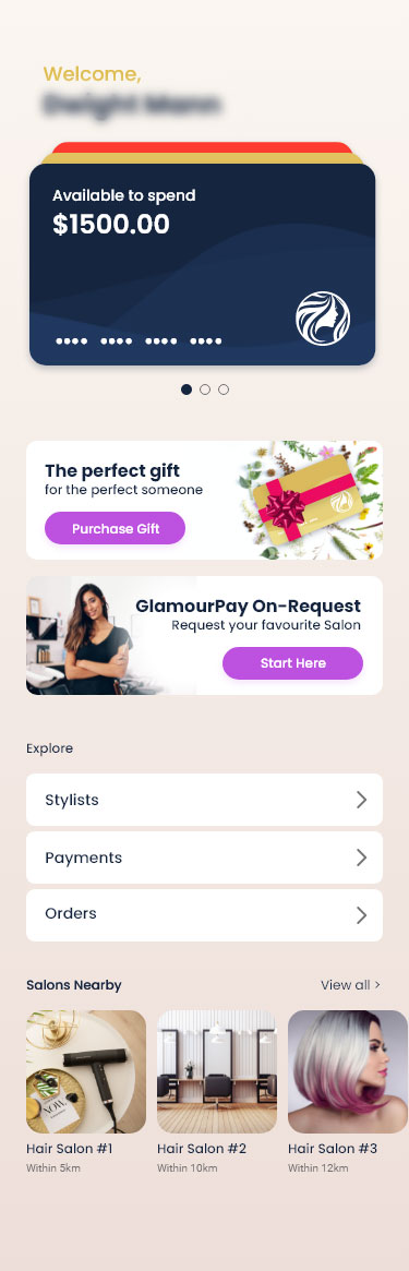
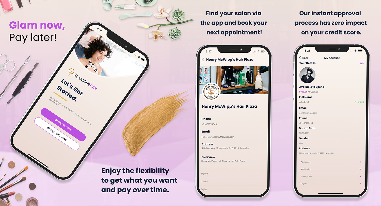
The key features it needed were an easy way to see how much money you had available, how much you owed and when your next payment was due as well as a quick way to connect with your desired salon. After understanding what the key features were, I did some research into how some of our competitors also offer these features and their services.I learned it was common for the Spend Limit to be the first item the user’s see as they log in, letting them be aware of the most important part of the app, what their limits were and if they had any outstanding payments.
Objectives
Solution
After the wireframes, the design started to come together, a hiccup I initially found with the first design I made was that although the layout was somewhat different each page, they all felt relatively the same and rather static and lacking character. This was fixed in the next prototype by changing the layout on certain pages hero section and adding animations to certain elements of a page that would instantly draw your eye and get the user engaged in the content. It helped keep the site to have its own personality overall while still making the user feel like they are on a brand new page.

Conclusion
Working with one of the developers, we actively came up with new solutions to any issues or flaws with the design as they were building the UI from my initial designs. After plenty of internal testing and a few reworks of the initial design, we were happy with the Interface and Userflow and submitted the app to Apple and Google.
Gallery

.svg)