2021
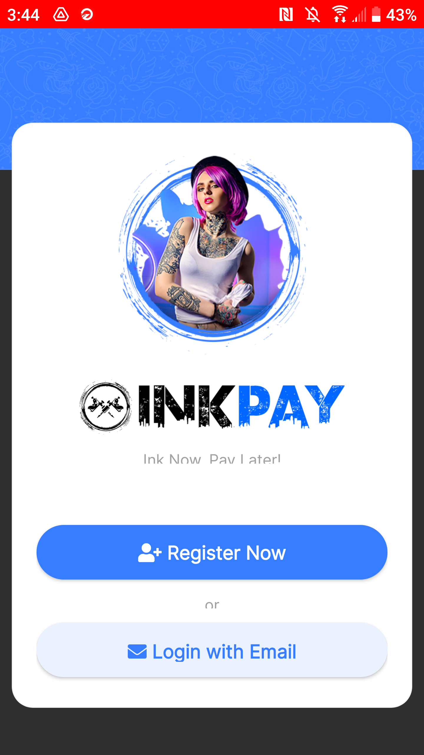
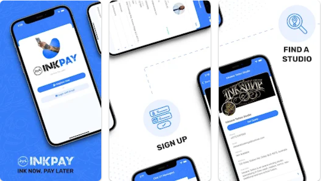
This project focused on designing the Inkpay mobile app for both Android and iOS, working closely with engineering and the business manager from initial discovery through delivery. The app needed to strike a balance between being visually clean and approachable, while remaining technically achievable within the constraints of NativeScript.
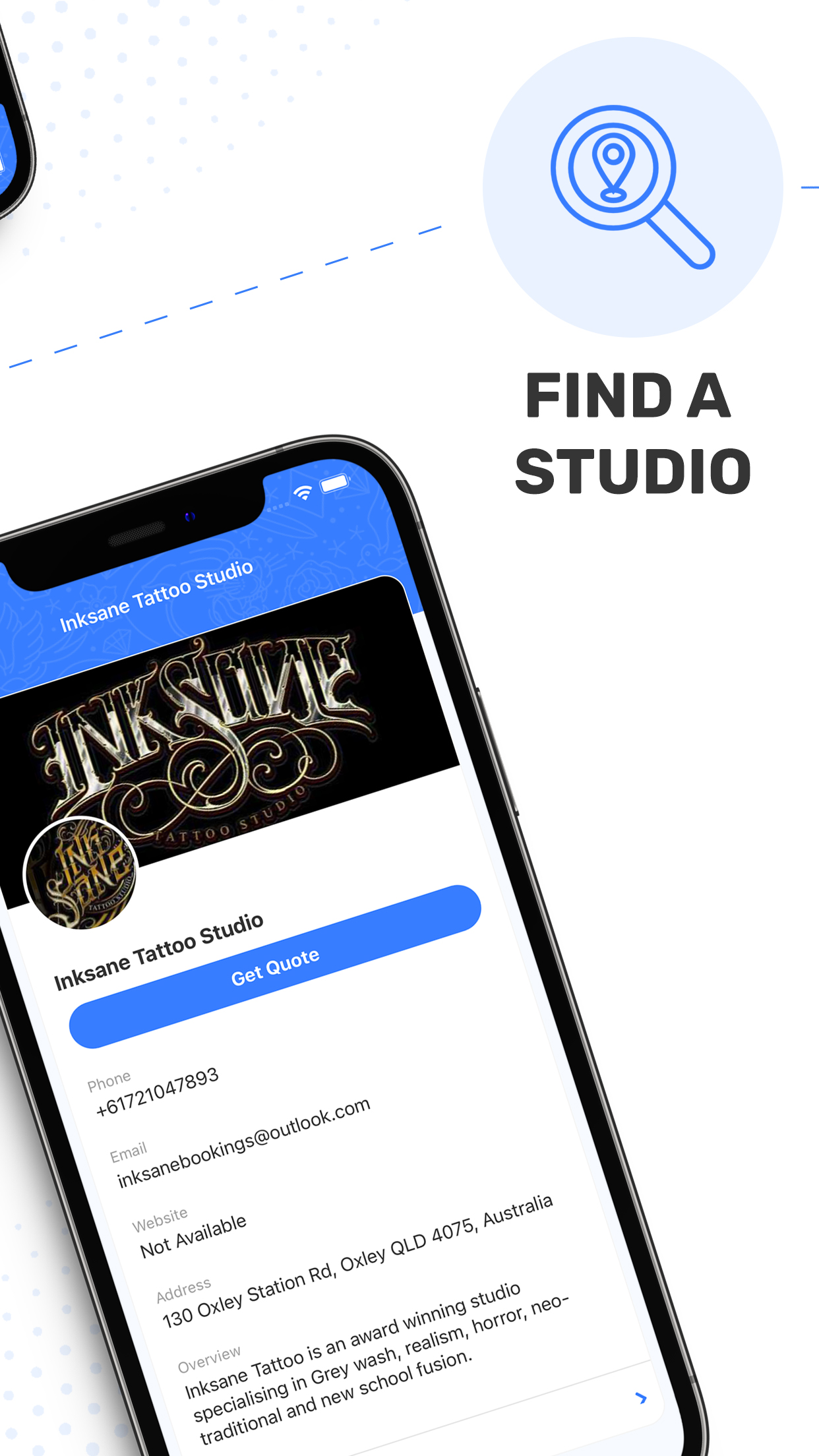
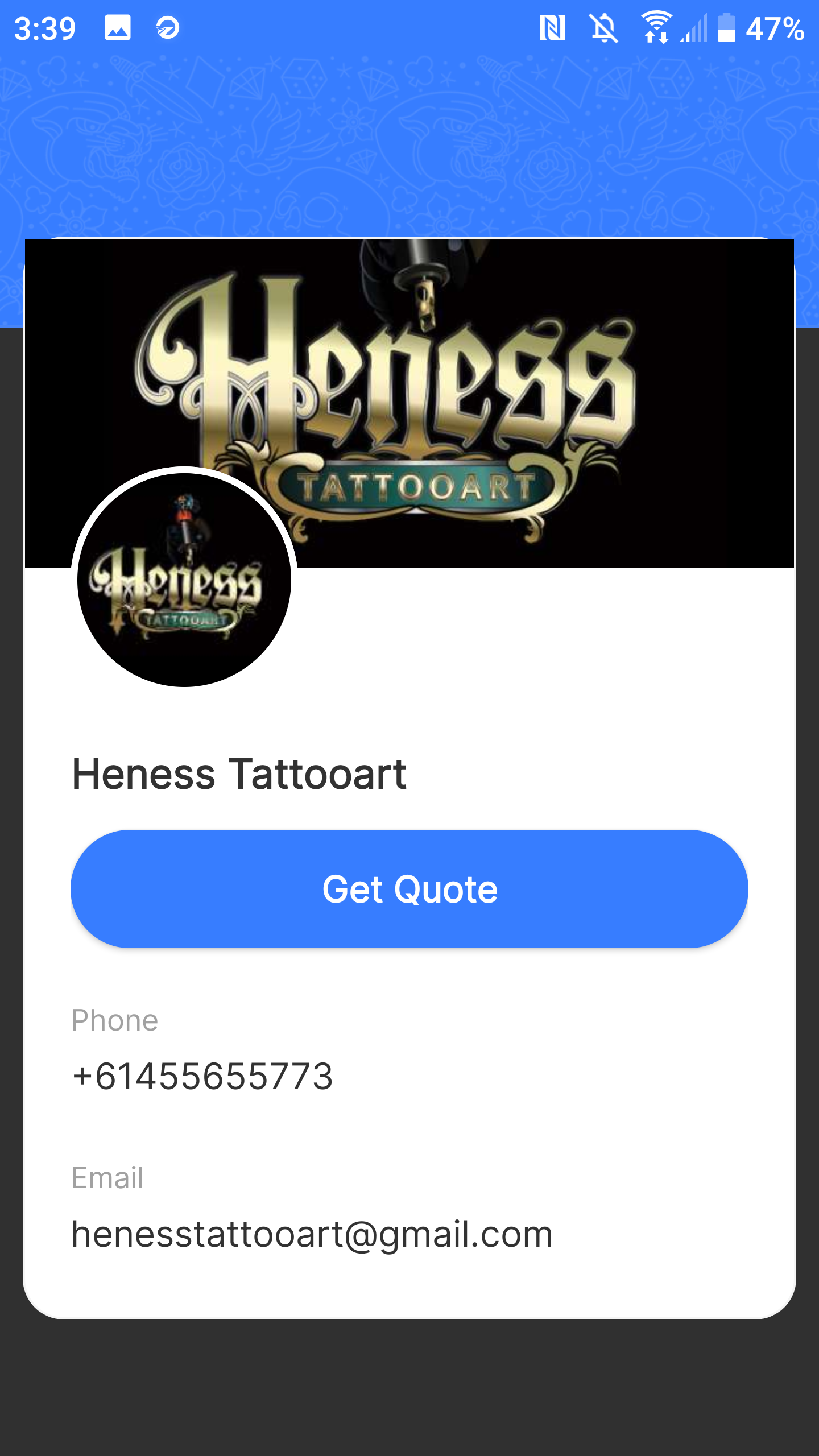
I began by researching comparable products and working with the business manager to understand the needs of both customers and Tattoo studios. Together, we identified the most common services offered by studios and designed the app to support configurable service options, allowing studios to enable or disable offerings based on what they provided.
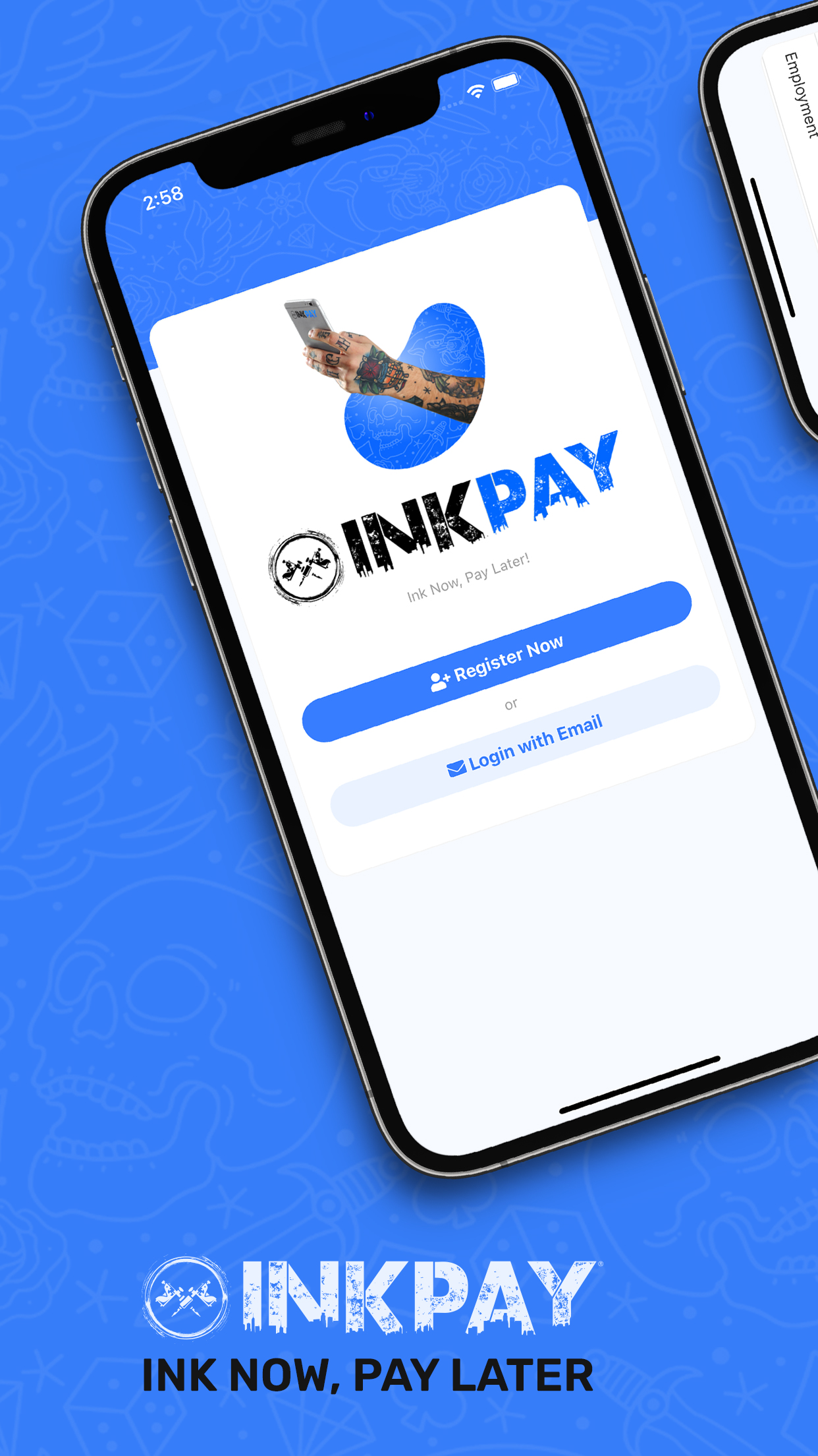
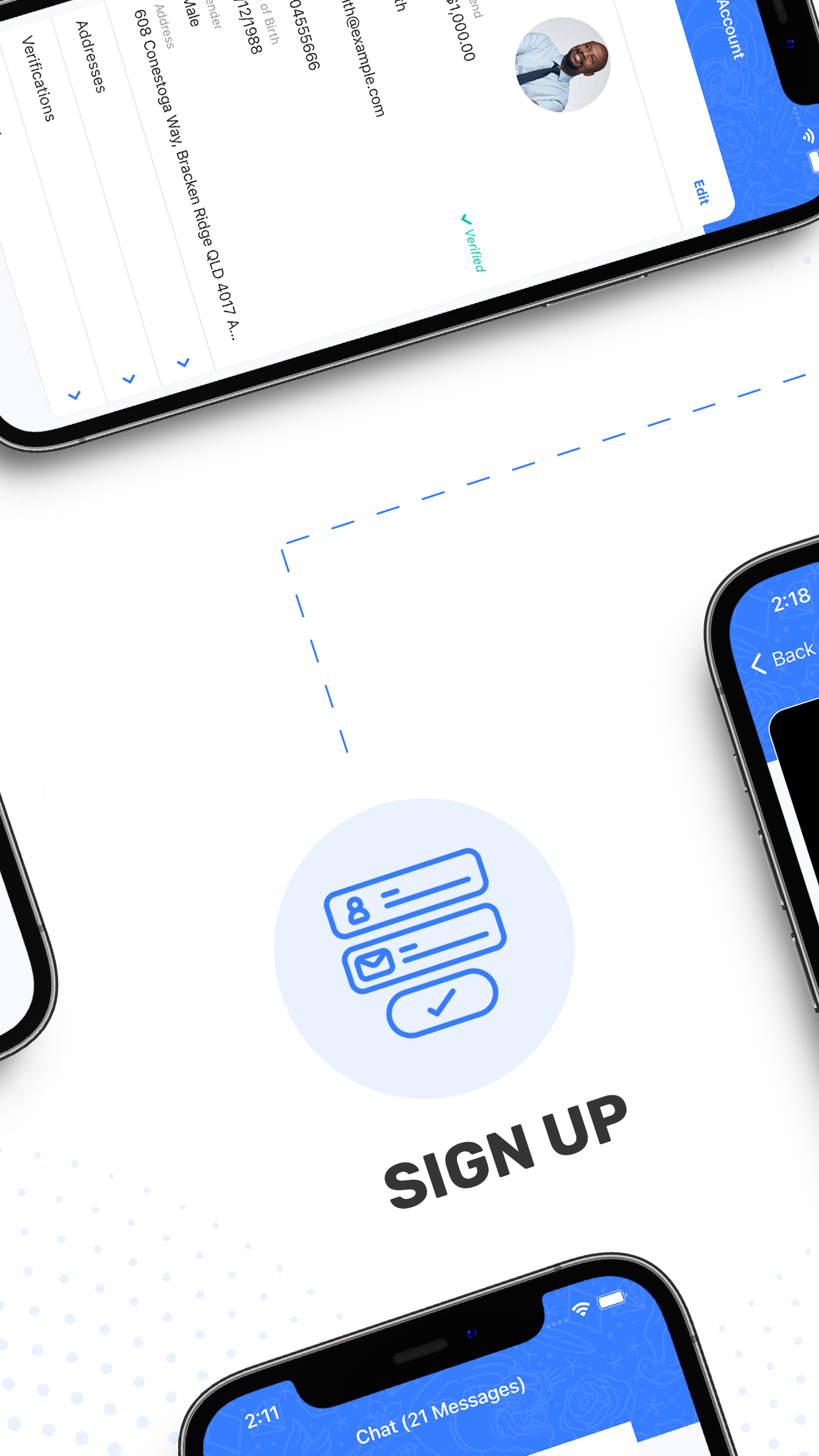
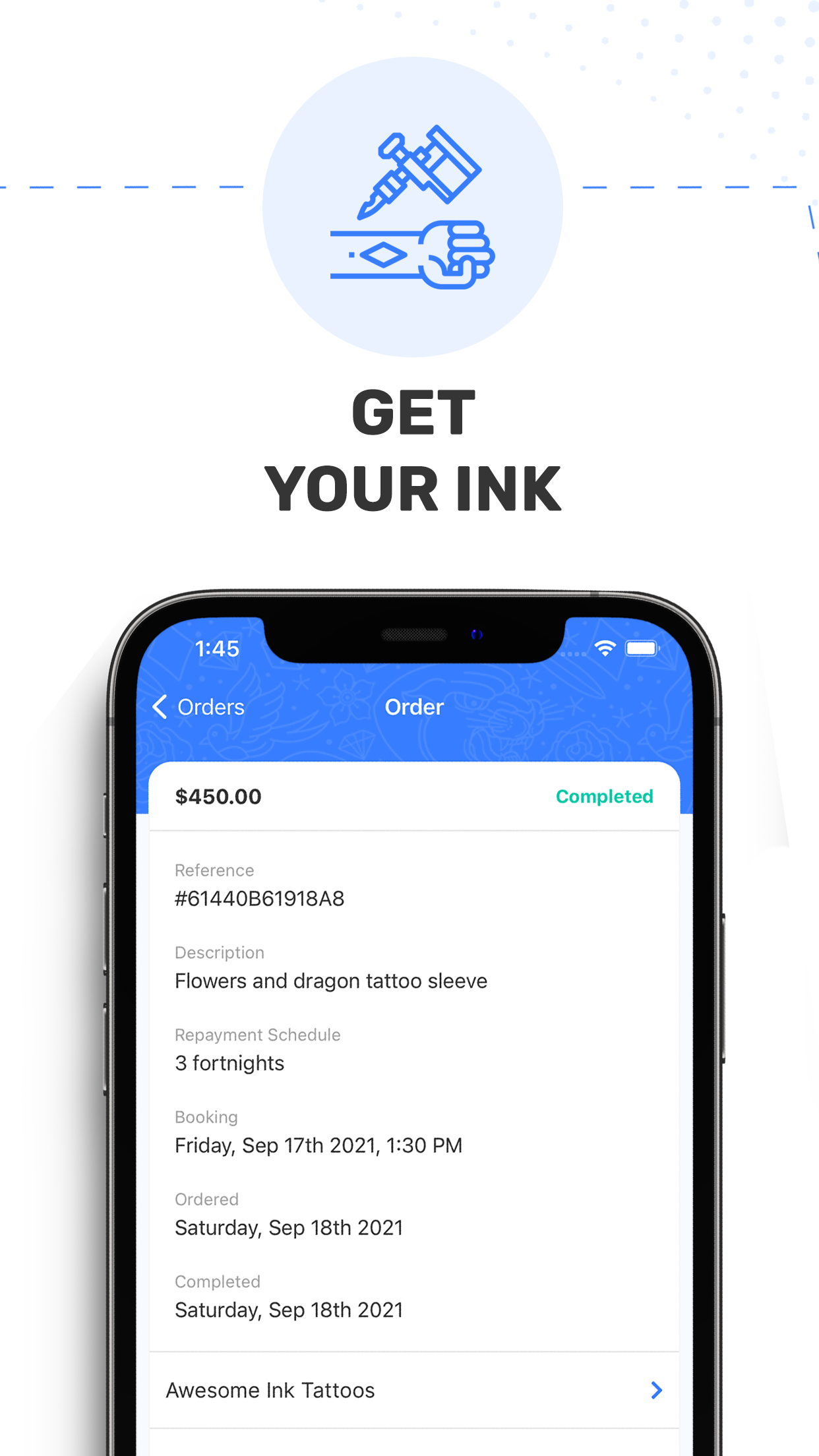
The app was designed to support the full booking lifecycle. Users could quickly sign up, apply for Inkpay, and book appointments with studios in a clear and straightforward flow. On the studio side, the app allowed teams to review booking requests, approve appointments, and assign jobs to staff members, giving studios better visibility and control over their workload.
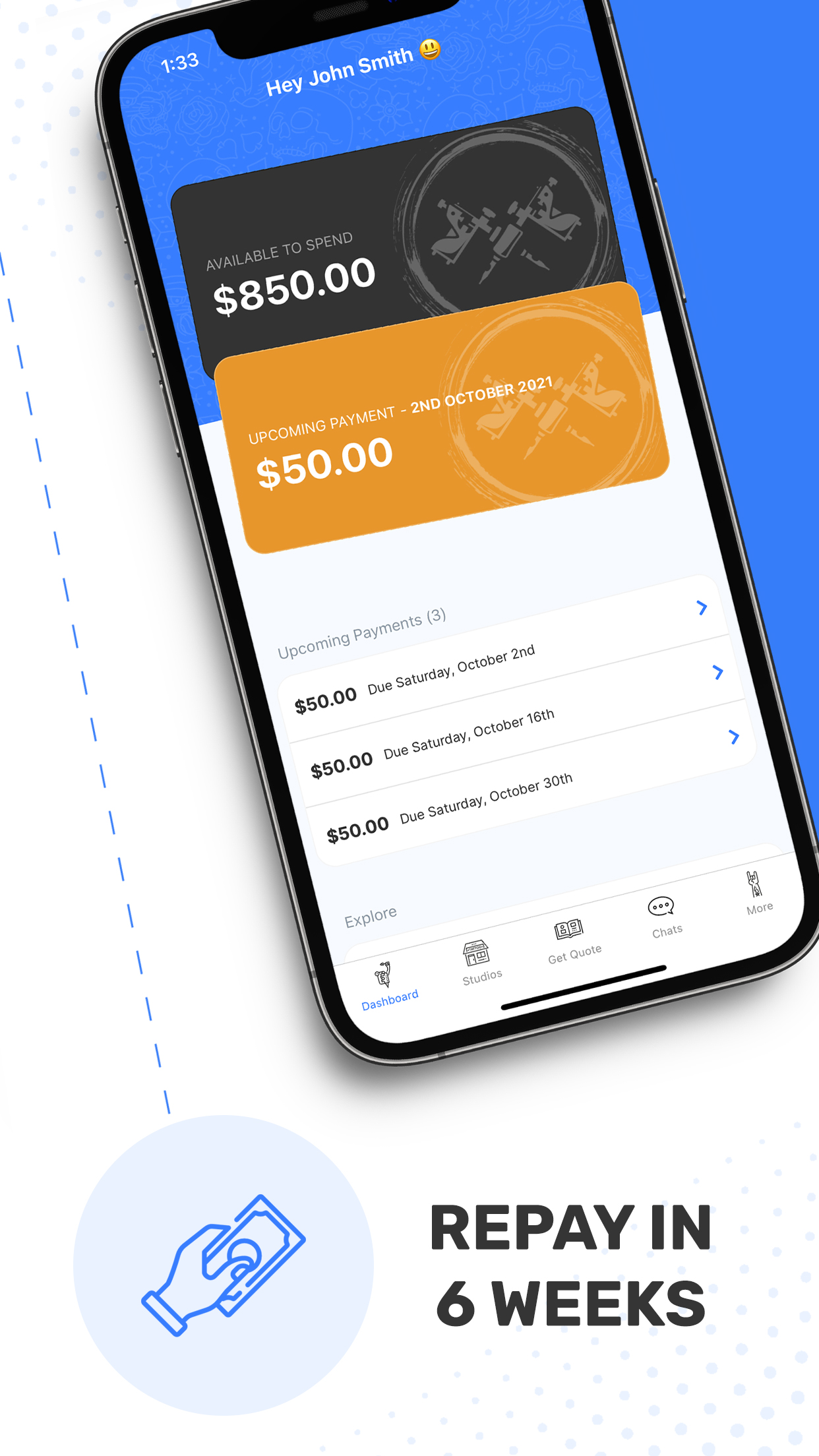
In addition to the customer-facing experience, the product included a backend dashboard that allowed users to track spending, view booking requests, and review past orders. This ensured the app supported both transactional needs and longer-term account management, resulting in a complete and cohesive experience across frontend and backend.

Throughout development, I worked closely with one of the engineers to iterate on the interface as it was being implemented. Rather than treating design and build as separate phases, we collaborated continuously, addressing usability issues and edge cases as they surfaced during development. This allowed us to adjust layouts, interactions, and hierarchy in real time, ensuring the final experience matched both the design intent and the technical constraints of NativeScript.
We ran multiple rounds of internal testing to validate the user flow, focusing on clarity around key financial information, navigation, and booking actions. These sessions helped identify friction points early, leading to several targeted revisions to the initial design.
Where appropriate, we also explored lightweight A/B testing to compare variations of key screens, such as the presentation of spend limits and call-to-action placement. This helped confirm which layouts and visual treatments were more effective at guiding users toward their next action.
Feedback from testing informed incremental improvements to both the interface and overall flow, resulting in a more confident and intuitive experience. Once the team was satisfied with stability and usability, the app was prepared for release and successfully submitted to both the Apple App Store and Google Play Store.

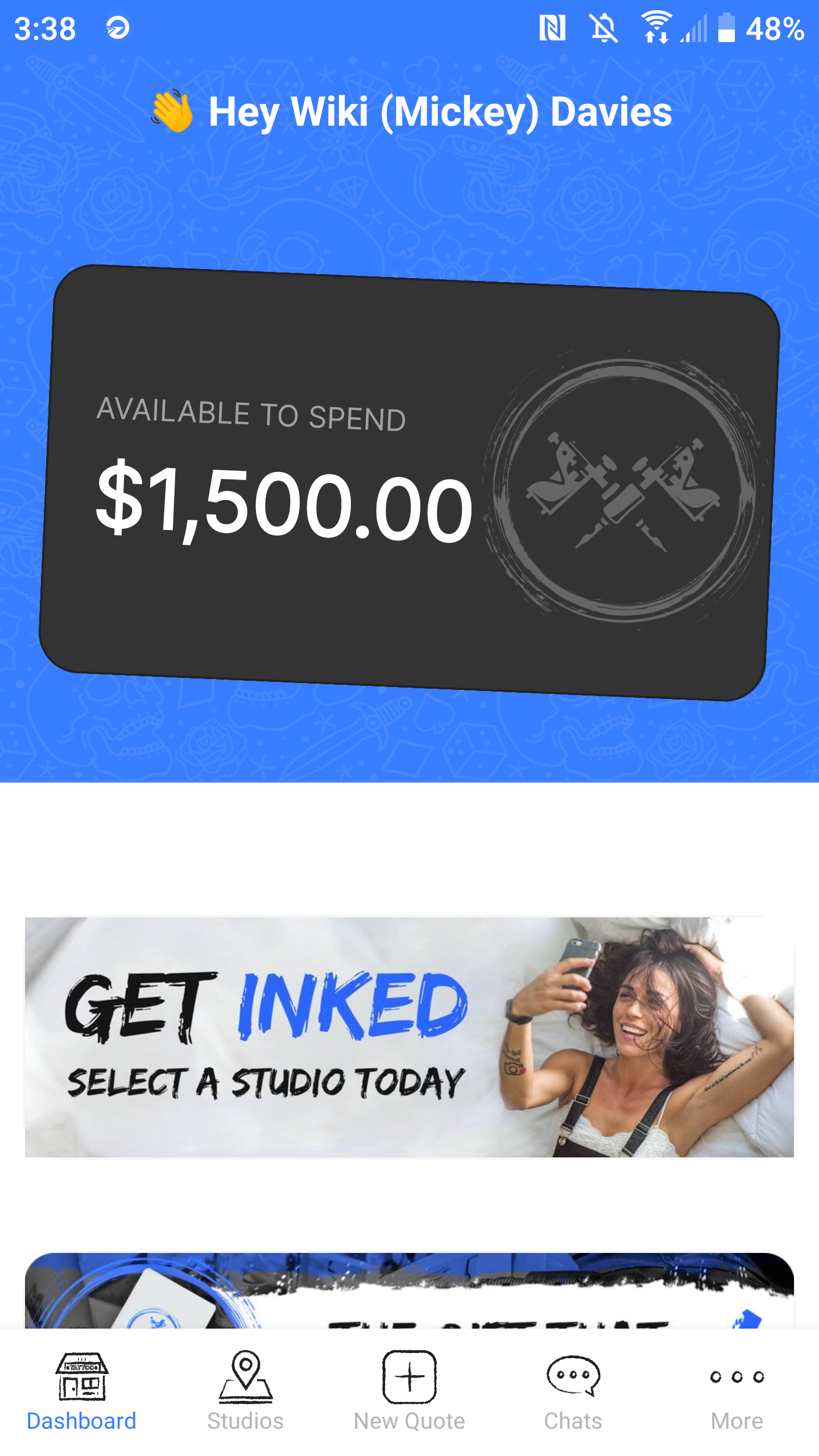

The final app delivered a clear and approachable experience that allowed users to quickly understand their financial position and take action with confidence. Key information such as available spend, outstanding balance, and upcoming payments was surfaced immediately, reducing uncertainty and supporting trust in the product.
Testing and iteration led to a smoother booking flow, helping users move from sign-up to studio selection with less friction. Studios benefited from clearer request management and better visibility into bookings, improving operational efficiency on their side.
The collaborative design and development process resulted in a stable release across both iOS and Android. Post-launch feedback confirmed that the app was easy to navigate and felt purposeful, validating the design decisions made through internal testing and A/B experimentation.
I'm currently looking for freelance or Inhouse opportunities, my inbox is always open or alternatively can be contacted on Linkedin or Artstation. Whether for a potential project or just to say hi, I'll try my best to answer your message!